




From the reception wall to a child’s sticker
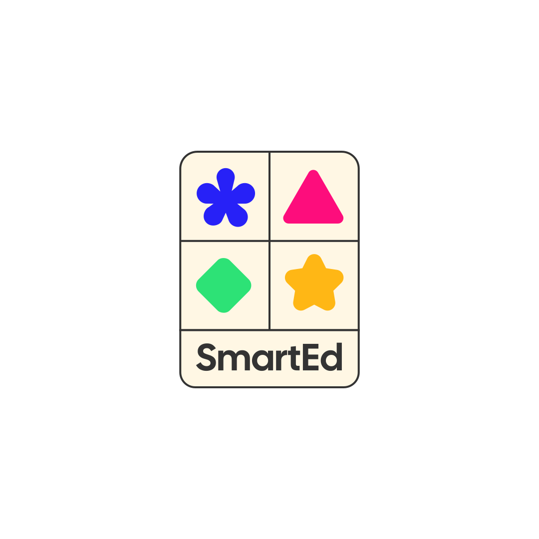
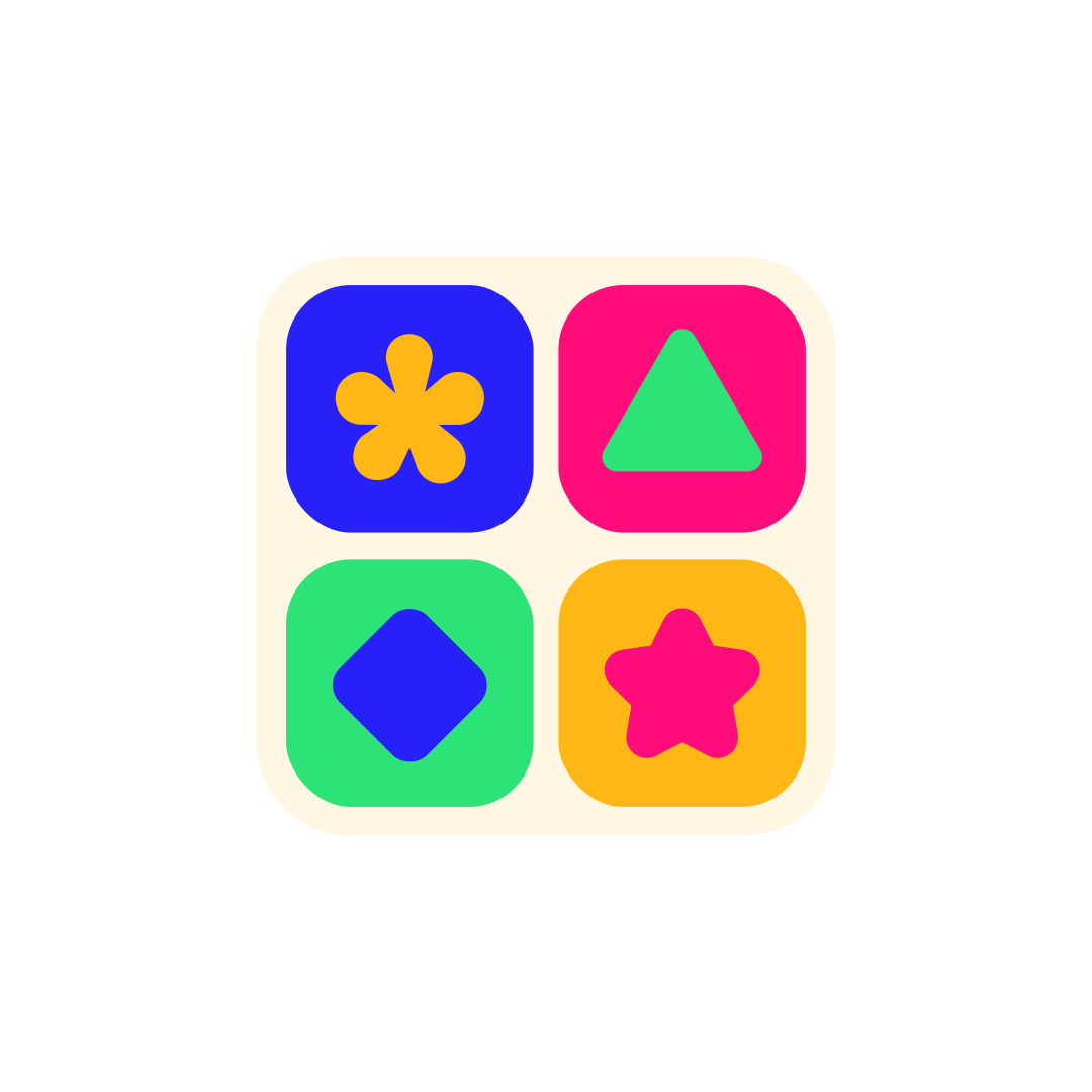
At SmartEd’s reception desk, a parent needs to know they’ve arrived at the right place. On a sticker a child might take home, there’s room for little more than a face and a few words. We designed SmartEd’s wordmark and family of geometric mascots to work at both scales. What changes is which part of the identity takes the lead.
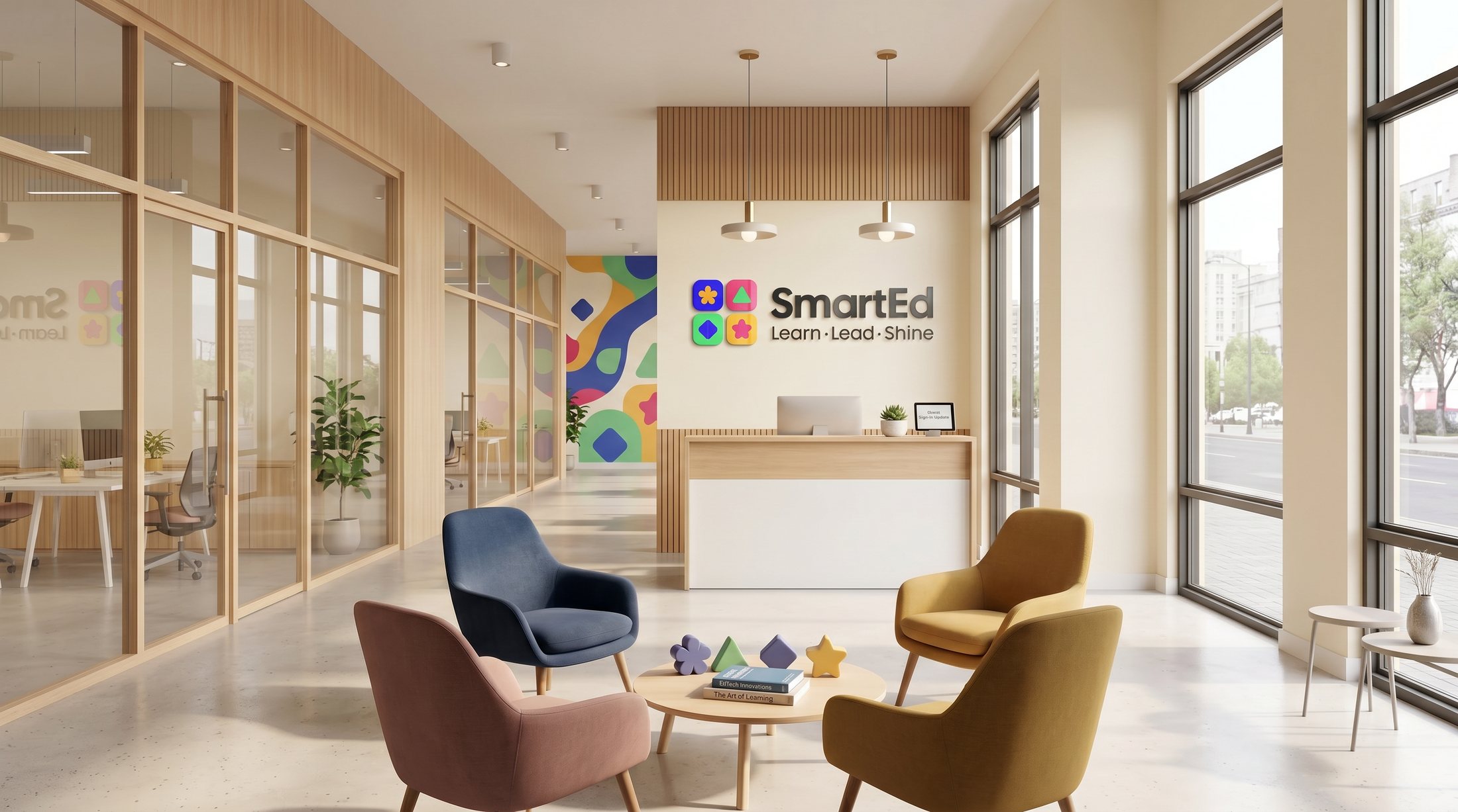
At reception, the name comes first. The SmartEd wordmark sits on the wall behind the desk beside a compact group of coloured shapes. More characters appear along the edge of the wall. From the entrance, the name is easy to find. As a visitor comes closer, the faces become part of the welcome.
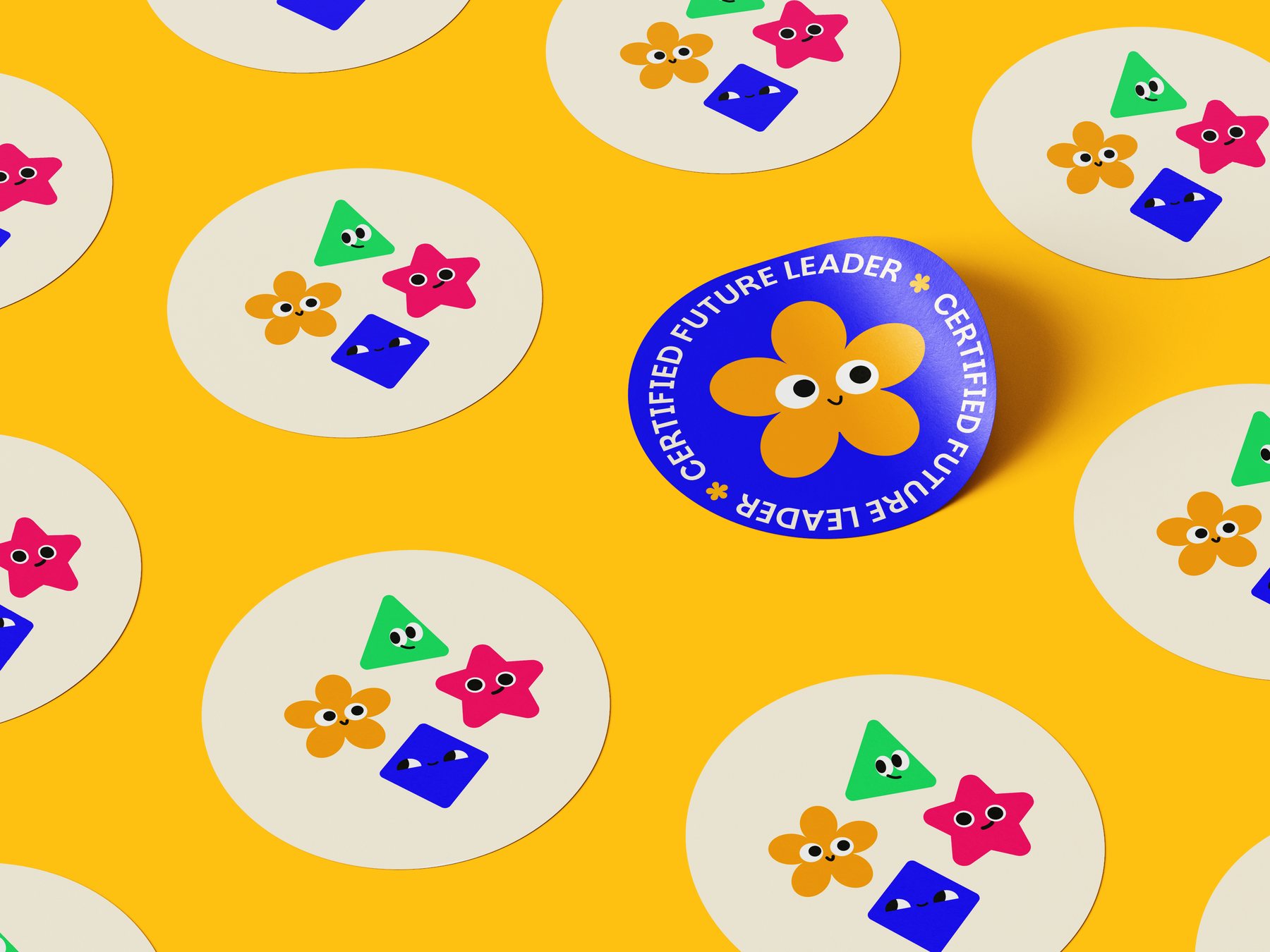
On a sticker, one character can carry the design. A yellow, flower-shaped mascot fills a blue circle, with Future Leader set around its edge. Other stickers bring the full cast together. Each character has a distinct silhouette and colour, so a child can pick a favourite before they can read the brand name.

In the social feed, the layout makes room for different stories. One tile gives the SmartEd name almost the entire frame. Another pairs a photograph with the line Helping children grow beyond grades. Bright colour blocks and bold type connect the two, even though one post leads with the name and the other with a person.