
Global Mission Impact Institute
One mark for the institute. Another for the businesses it certifies.
Watch the brand film ↓On GMI’s own letterhead, the logo tells you who is speaking. On another company’s packaging, it has a different job.
It needs to tell you that the company has earned GMI certification. That distinction shaped the identity The Wider Collective developed for the Global Mission Impact Institute.
The brief
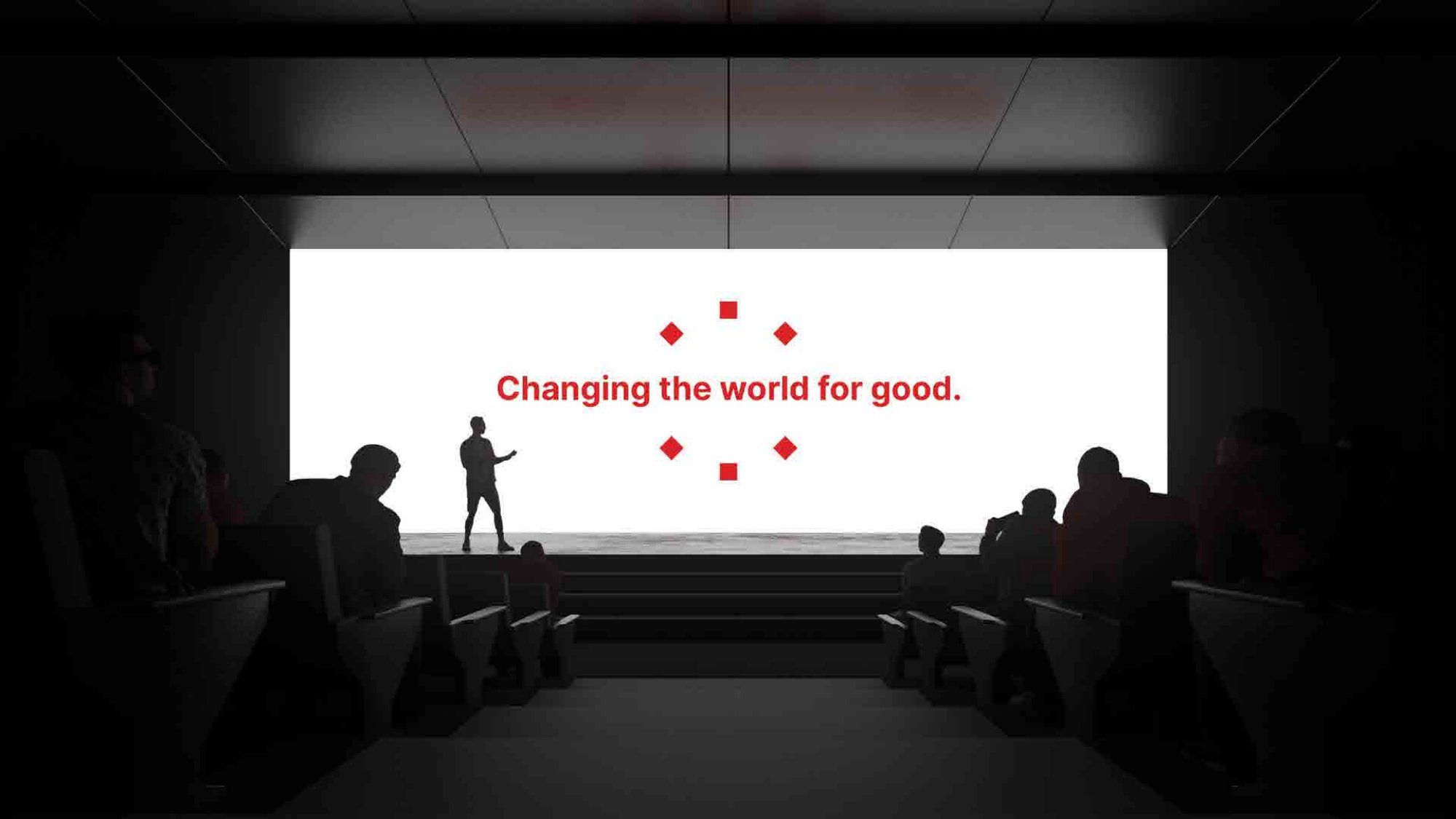
GMI works with businesses that want to connect profitability with social responsibility. Its founding idea, “Changing the World for Good,” captured the ambition. Our brief was to give that idea a recognisable form and establish how the institute and the enterprises it certifies could each use it.
We began with a brand charter. It set out what GMI meant by impact and who it needed to reach, including an audience the institute itself described as sceptical of institutions. That made the certification mark one of the most important pieces of the brief. A reader encountering GMI for the first time might see it on someone else’s product.
A figure carrying a torch
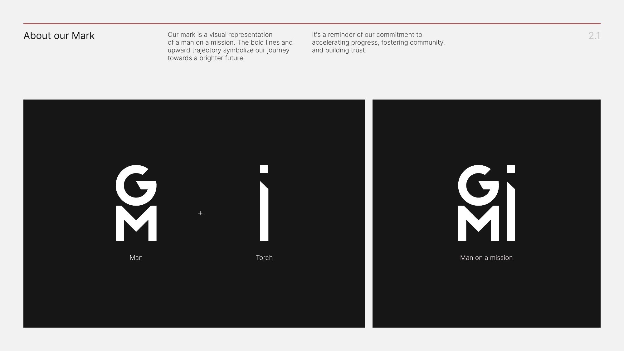
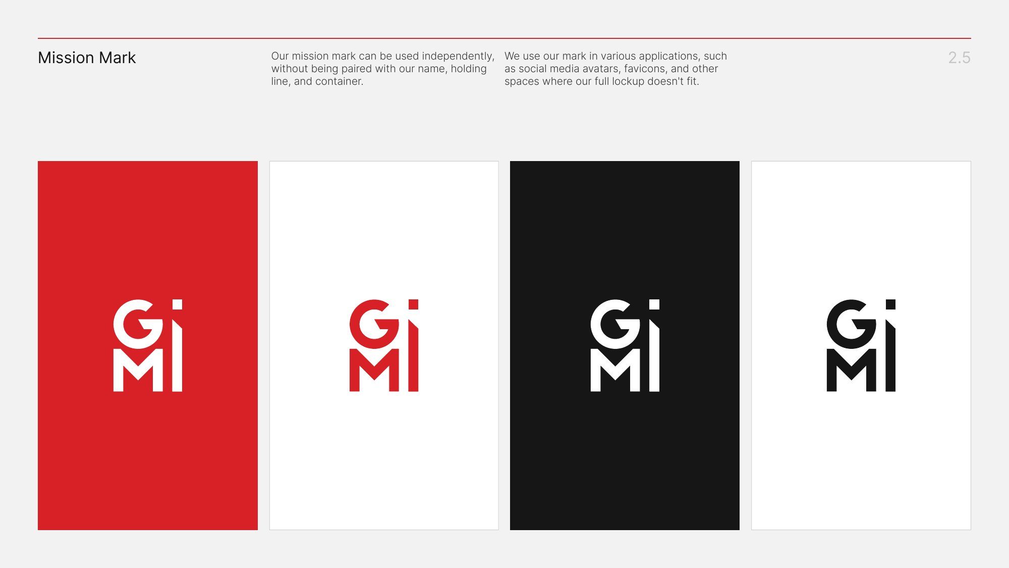
The starting point for the symbol was a person carrying a torch. We brought the figure and flame together in a single mark, using bold lines and an upward angle to suggest someone moving forward. It gave the word mission a human image the institute could use even where its full name would never fit.
One symbol, built out
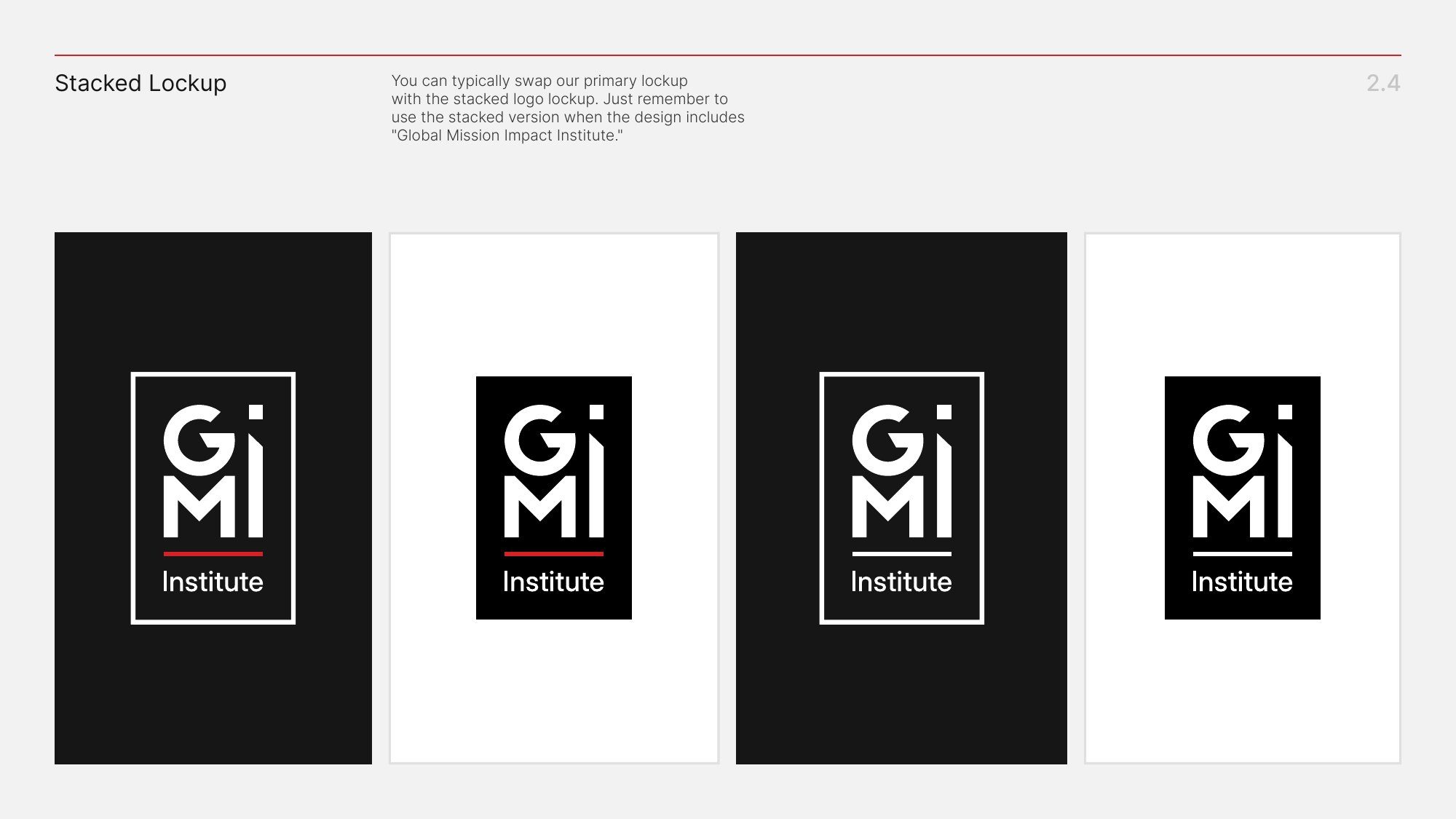
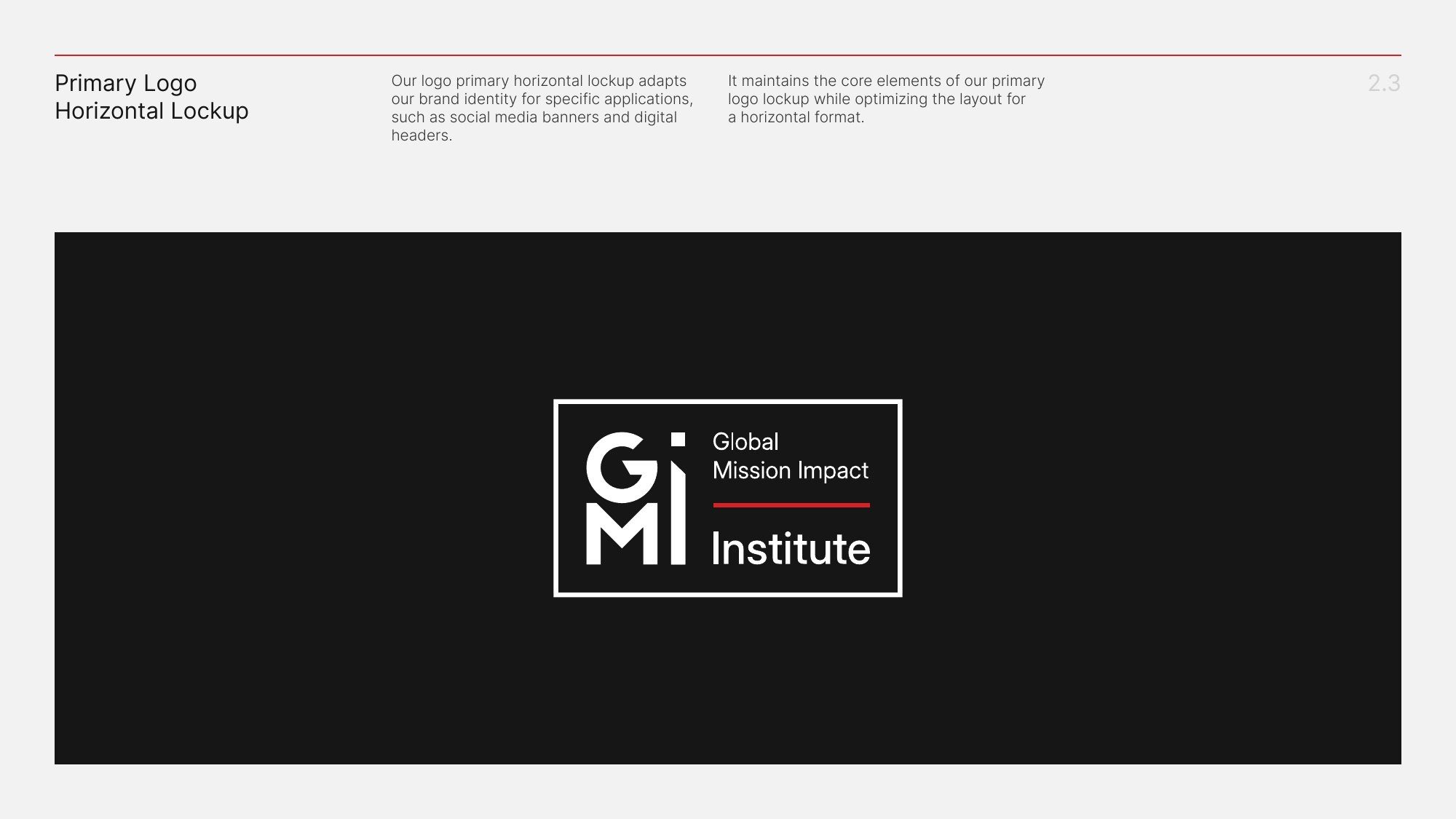
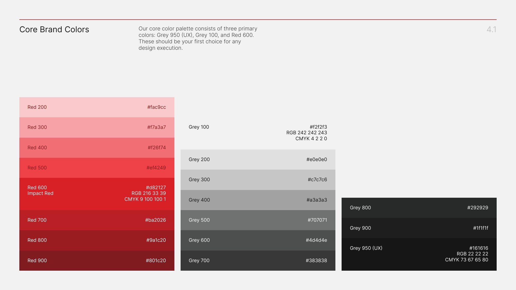
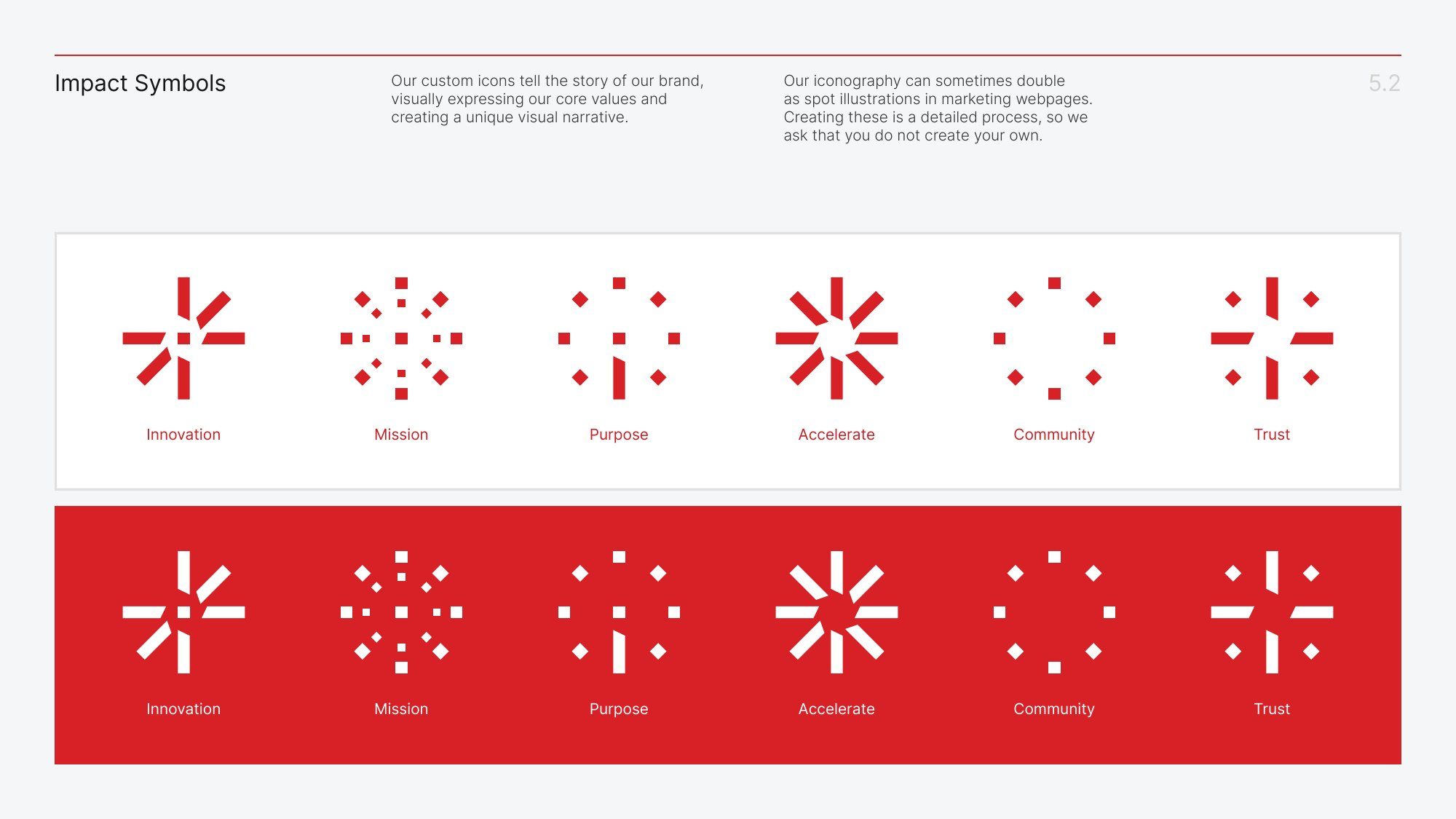
We built the identity out from that symbol. A stacked version carries the full Global Mission Impact Institute name. A horizontal version fits a website header, while the symbol alone works at the scale of a profile picture or browser icon. Impact Red ties the versions together. A supporting grey palette and two typefaces, Inter and TT Hoves, carry the longer work of explaining GMI’s programmes in documents and presentations.
What “Certified” means on a pack
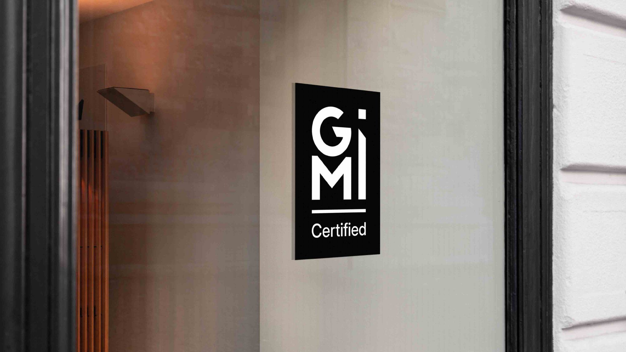
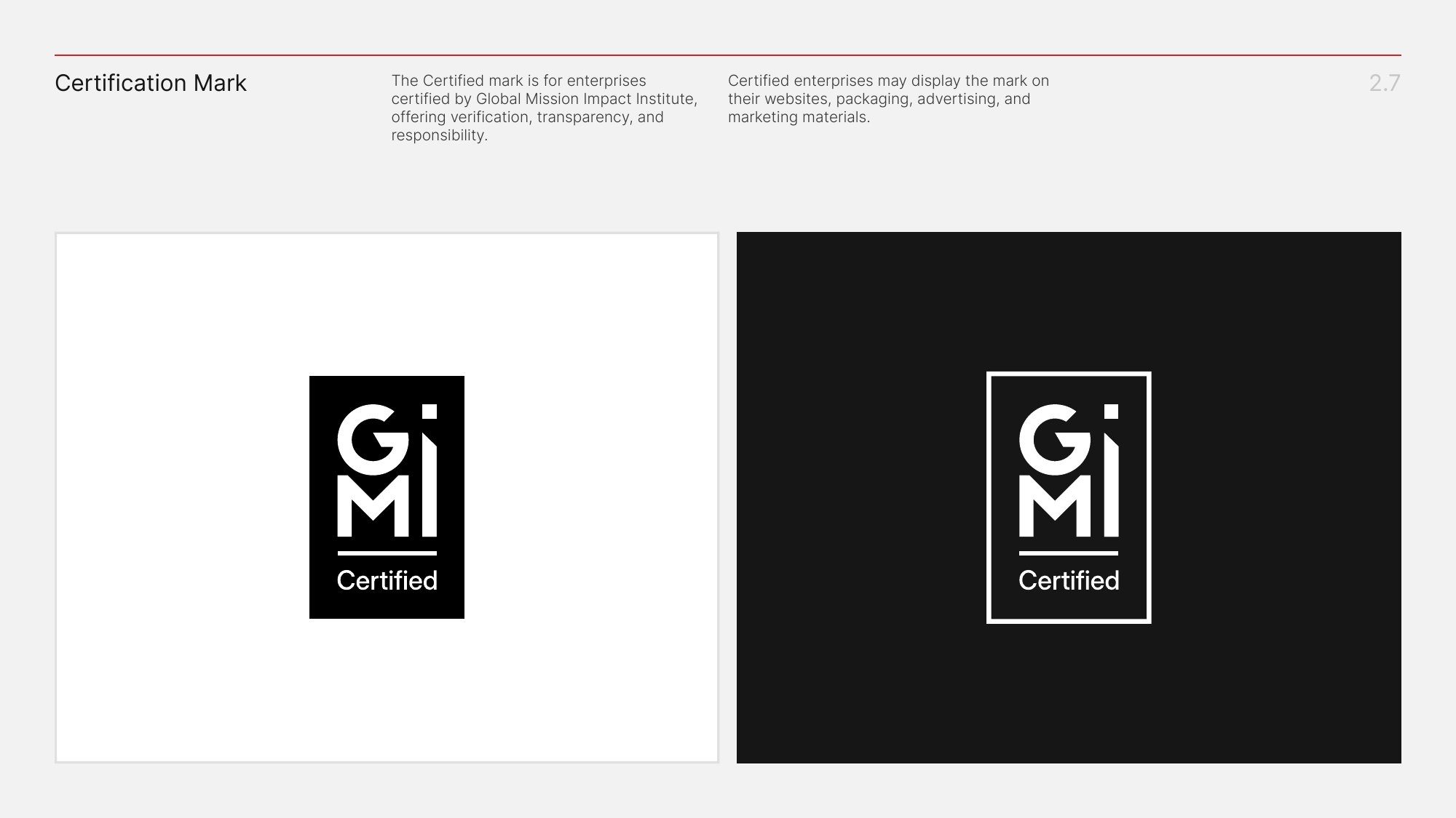
An enterprise displaying GMI certification still needs to look like itself. We designed a dedicated Certified mark that could sit alongside a company’s own identity and make its relationship with the institute clear.
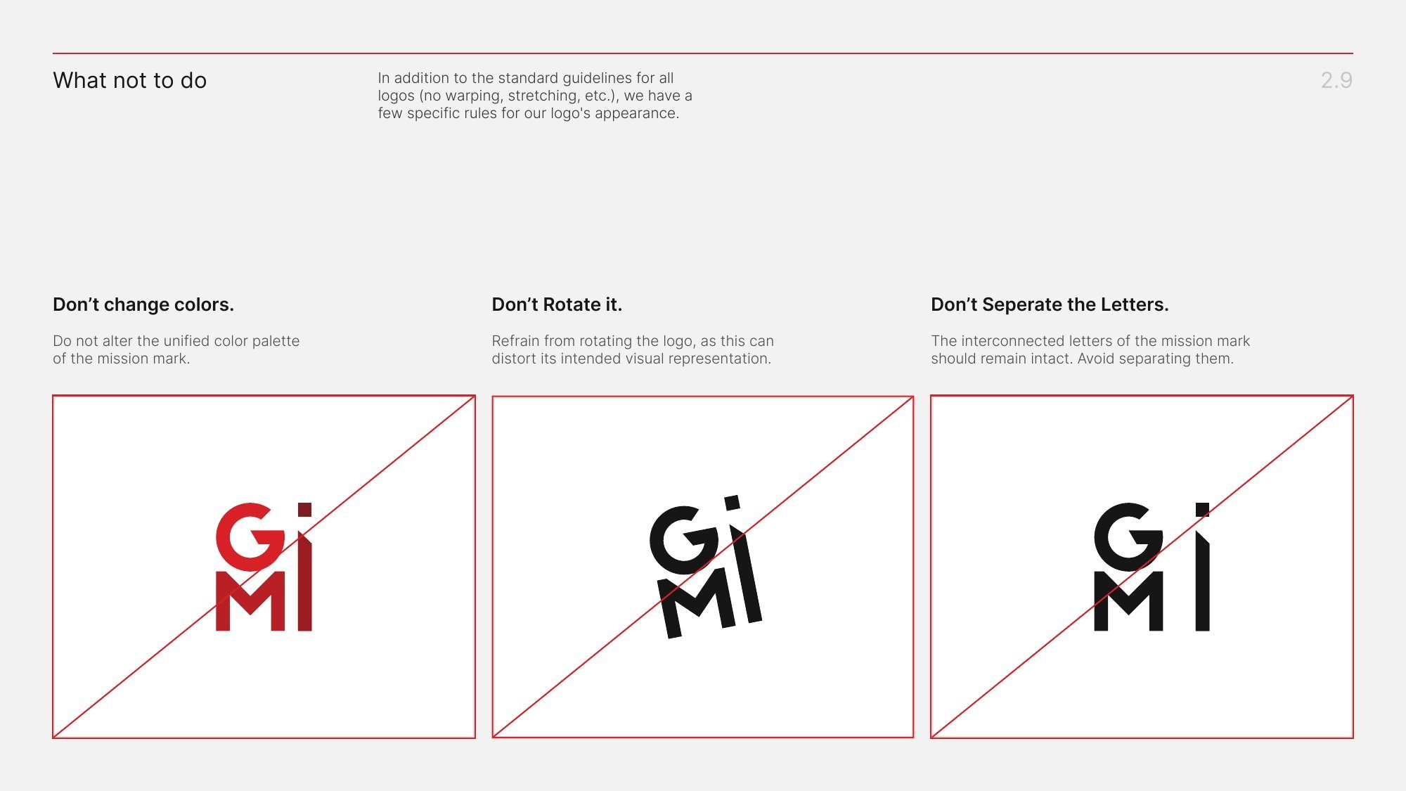
The guidelines show where certified enterprises may use the mark, including packaging, websites, and advertising. They also distinguish certification from a partnership and give GMI’s team guidance on colour, contrast, and logo use. Those details matter when the person applying the mark is working on a different brand, in a different format, with limited space.
The mission on film
The guidelines explain how to use the identity. The brand film introduces the idea behind it. We brought together original footage, AI-generated imagery, and motion graphics to tell GMI’s story in just under two minutes. Motion gave us room to explore the sense of forward movement already present in the torch symbol and connect it back to the institute’s purpose.
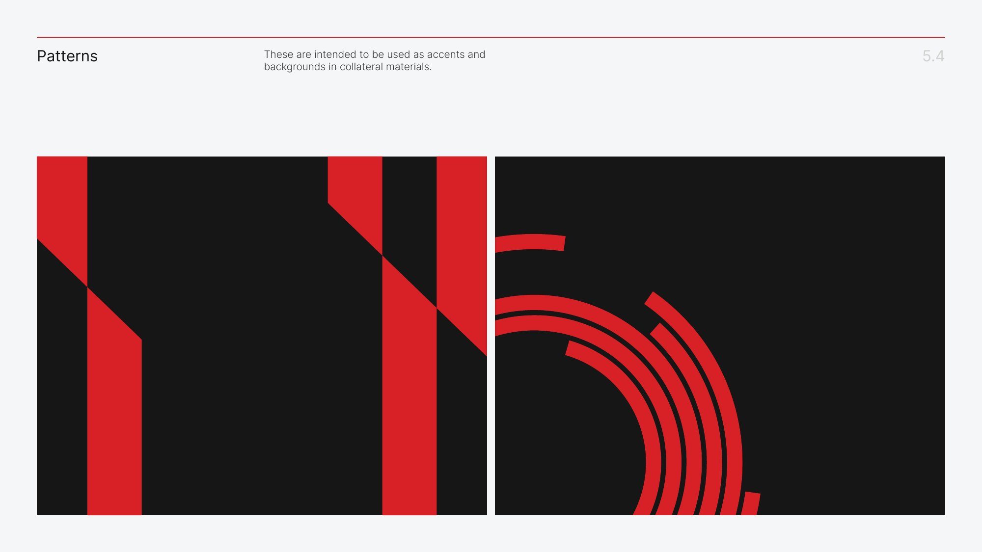
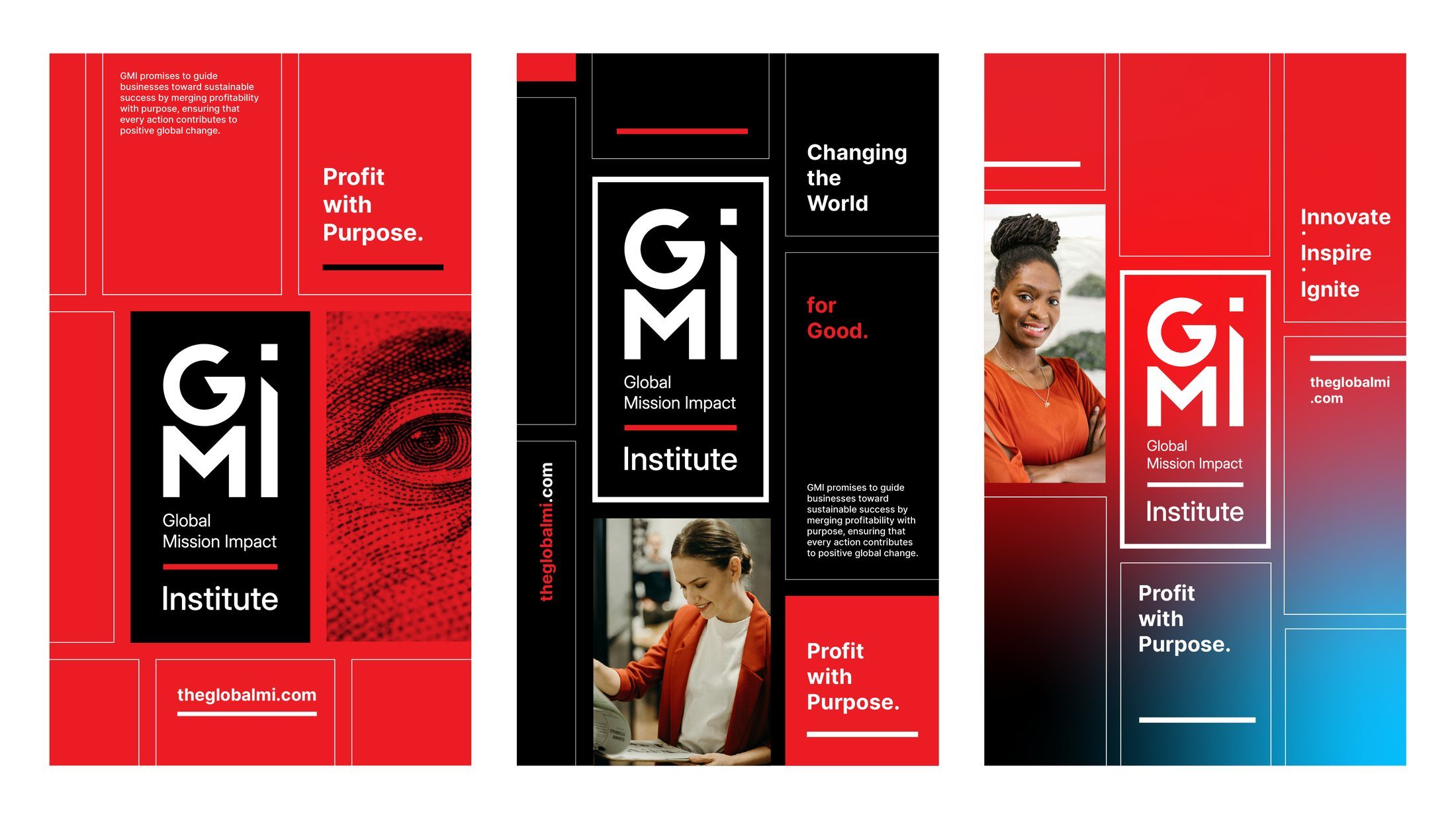
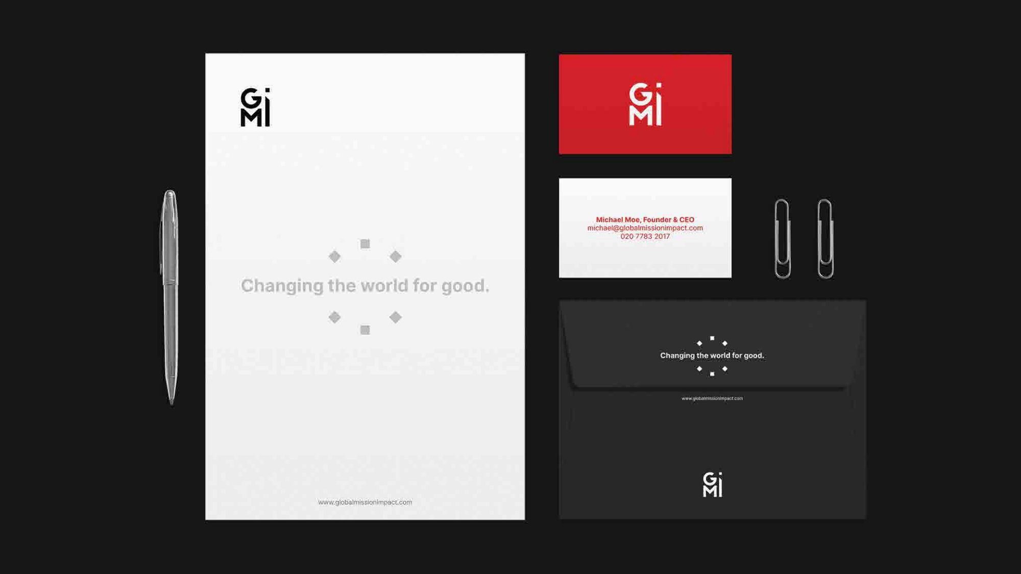
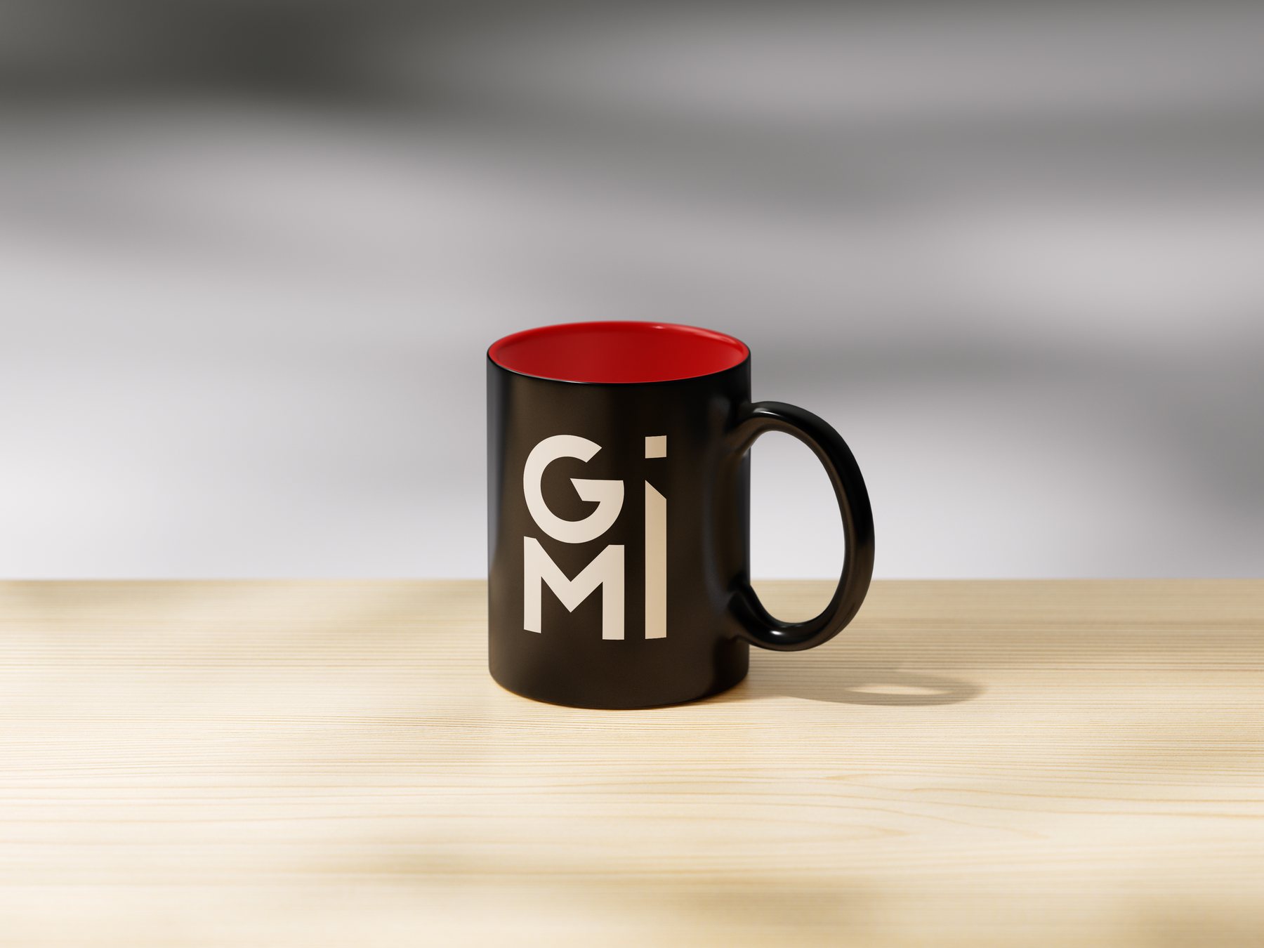
Together, the charter, identity guidelines, certification mark, and film give GMI a way to introduce itself at very different scales. The film can tell the founding story in full. On a package, a single word beside the mark does the essential work: Certified.
- Studio
- The Wider Collective
- Deliverables
- Brand charter, identity, certification mark, guidelines, brand film
- Guidelines
- 50 pages, Version 1.0