
SmartEd brings globally trusted, research-backed learning to Bangladesh. It needed a brand that parents would trust and children would love.
We built SmartEd’s brand from strategy to signage: a brand charter, a parent-brand architecture, a bright visual identity with a family of mascots, and the applications that carry it into centres, classrooms and feeds.
From one programme to a parent brand.
SmartEd was known through a single product, I Can Read, a phonics-based English course from Singapore. With centres, schools, teacher training and future programmes ahead, it needed to stand on its own.
The brief was clear on two points: SmartEd should not be overshadowed by I Can Read, which should feel like a collaboration; and the brand had to separate itself from tuition and coaching centres such as Kumon, 10 Minute School and Shikho.
Confidence, curiosity, leadership.
Starting from a branding workshop with the founders, we wrote a brand charter covering purpose, vision, positioning, values, personality and tone of voice.
SmartEd is positioned as a premium development partner, not a coaching alternative: credible and structured for parents, warm and encouraging for children.
SmartEd leads. Programmes follow.
SmartEd becomes the master brand, the trusted platform behind every partnership. I Can Read is presented as its flagship product and first proof point, leaving room for literacy, communication, leadership and future-skills programmes to join under the same name.
Four shapes. One way to learn.
The symbol sets four simple shapes, a flower, a triangle, a diamond and a star, in rounded tiles, like building blocks on a learning table. Each tile pairs two brand colours, so the mark is playful for children and orderly enough for parents.
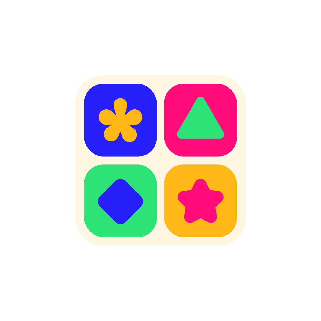 Symbol
 Wordmark
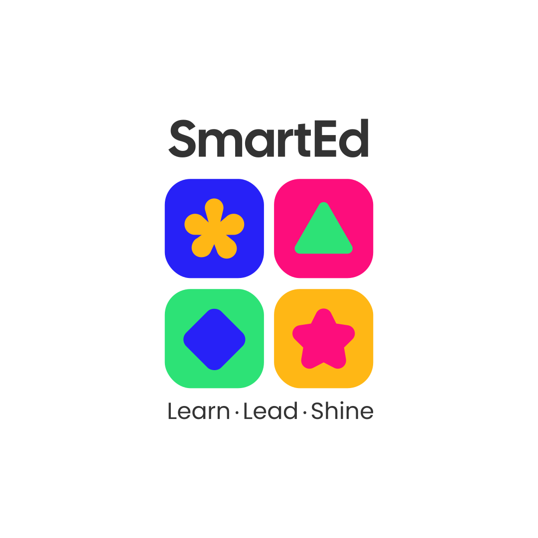 Stacked lockup
 One-colour badge
A cast children remember.
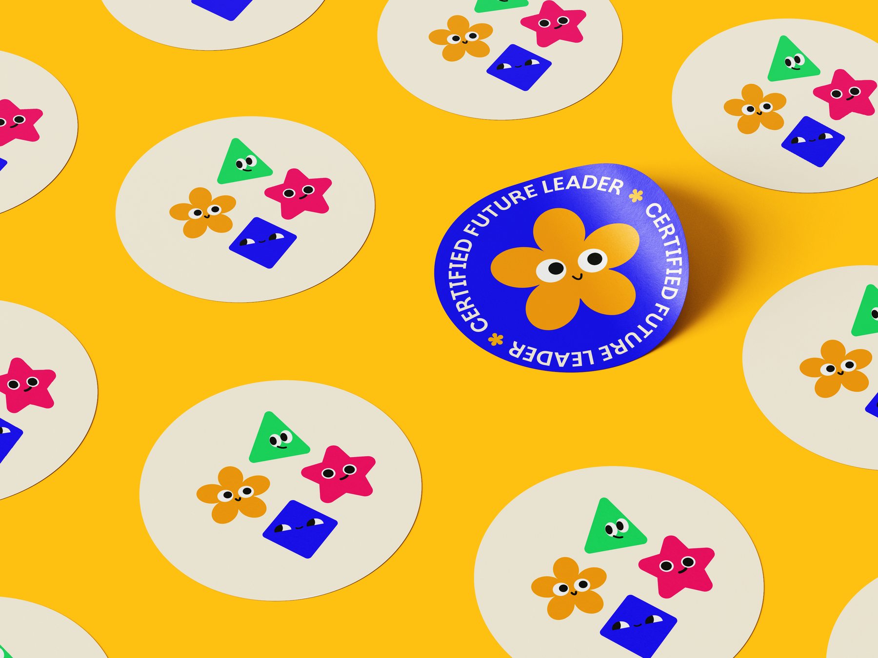
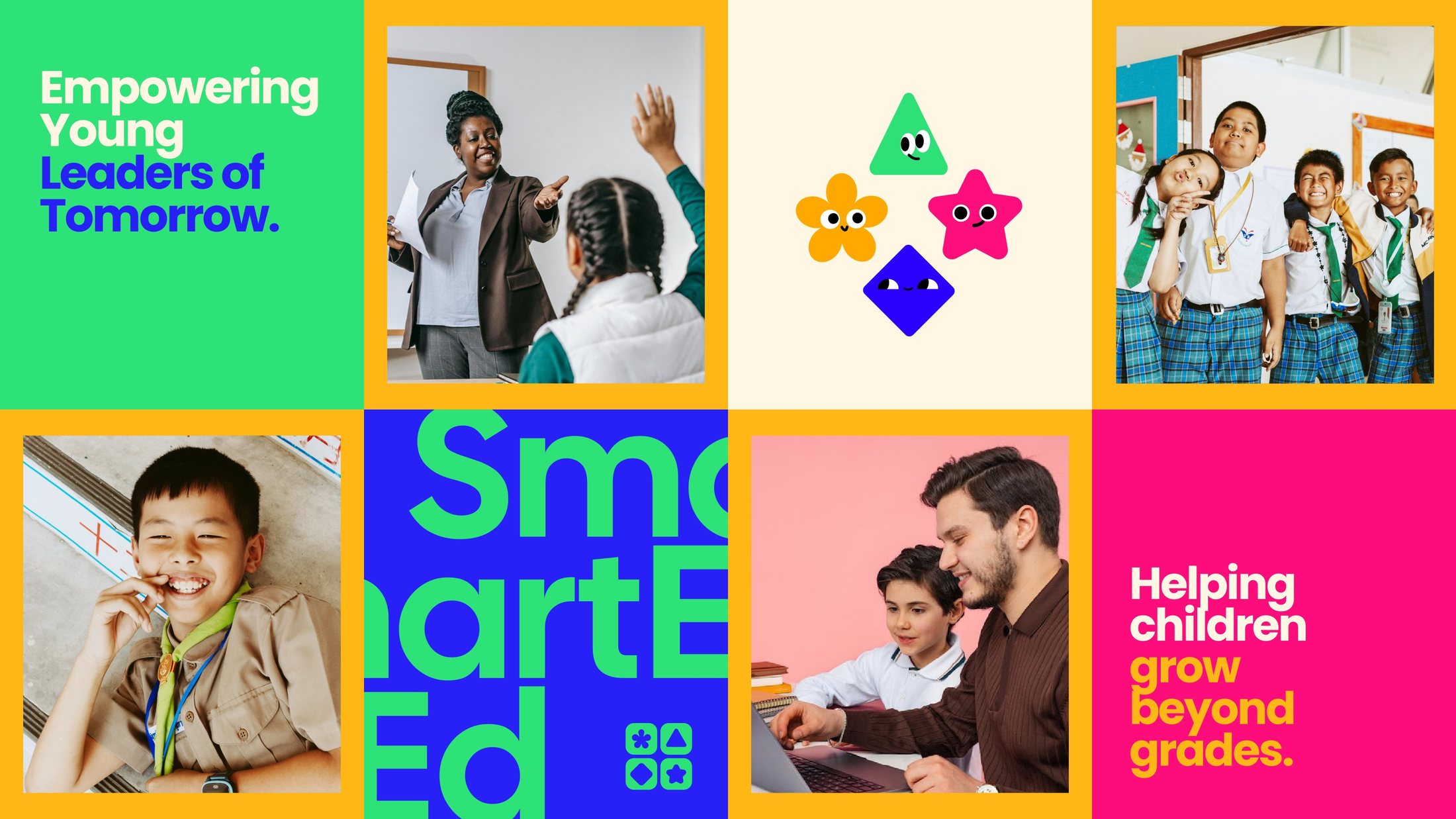
The four shapes come to life as characters. With faces and expressions, they become guides that appear on stickers, certificates, social posts and classroom materials, so children recognise SmartEd before they can read the name.






Learn. Lead. Shine.
From the front desk to the feed.
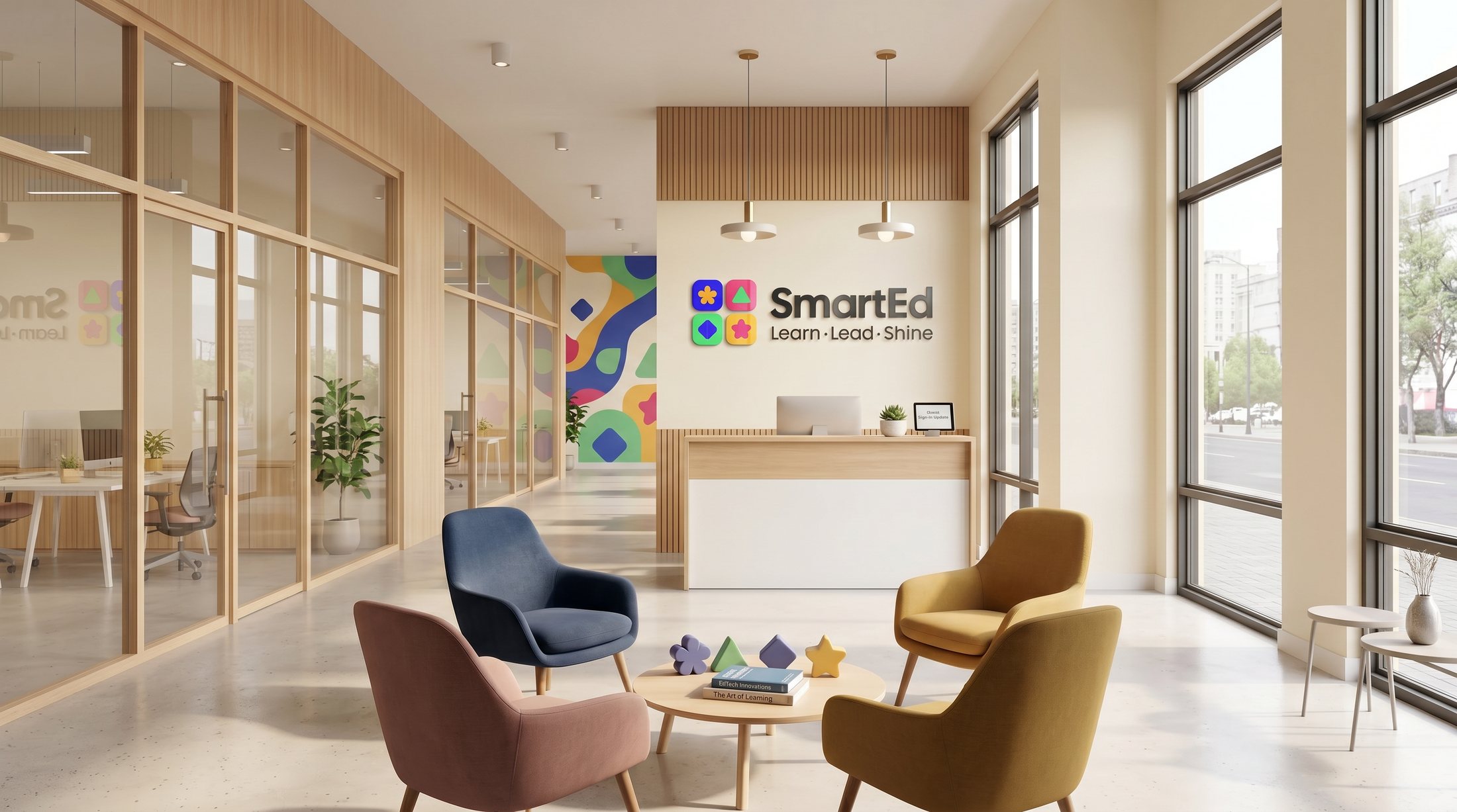
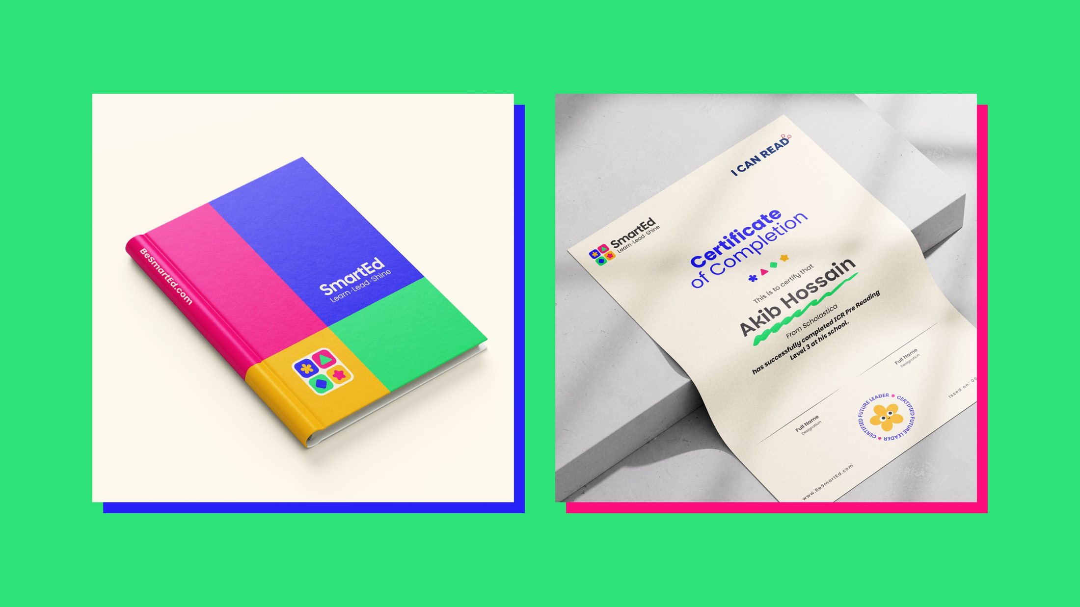
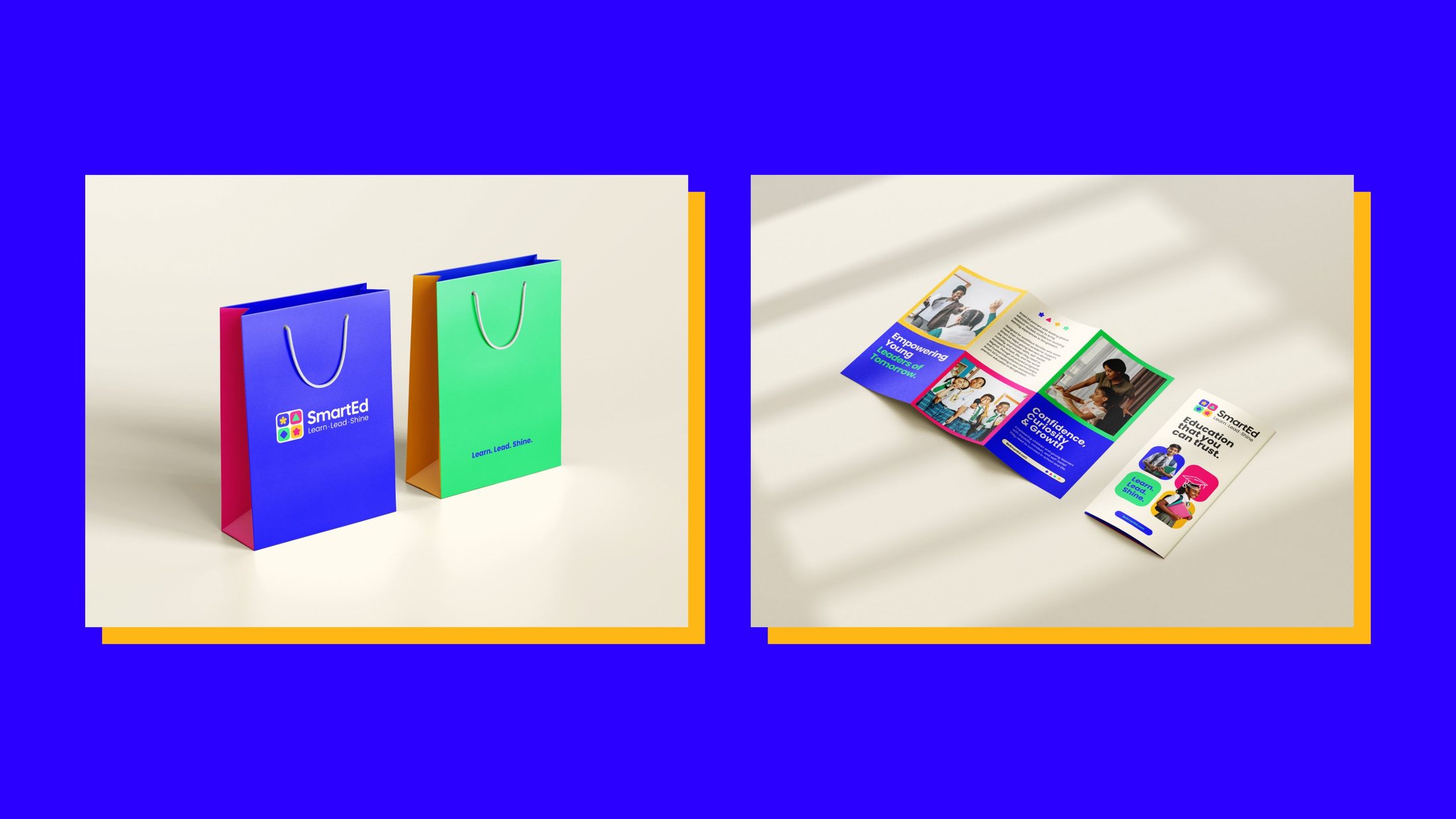
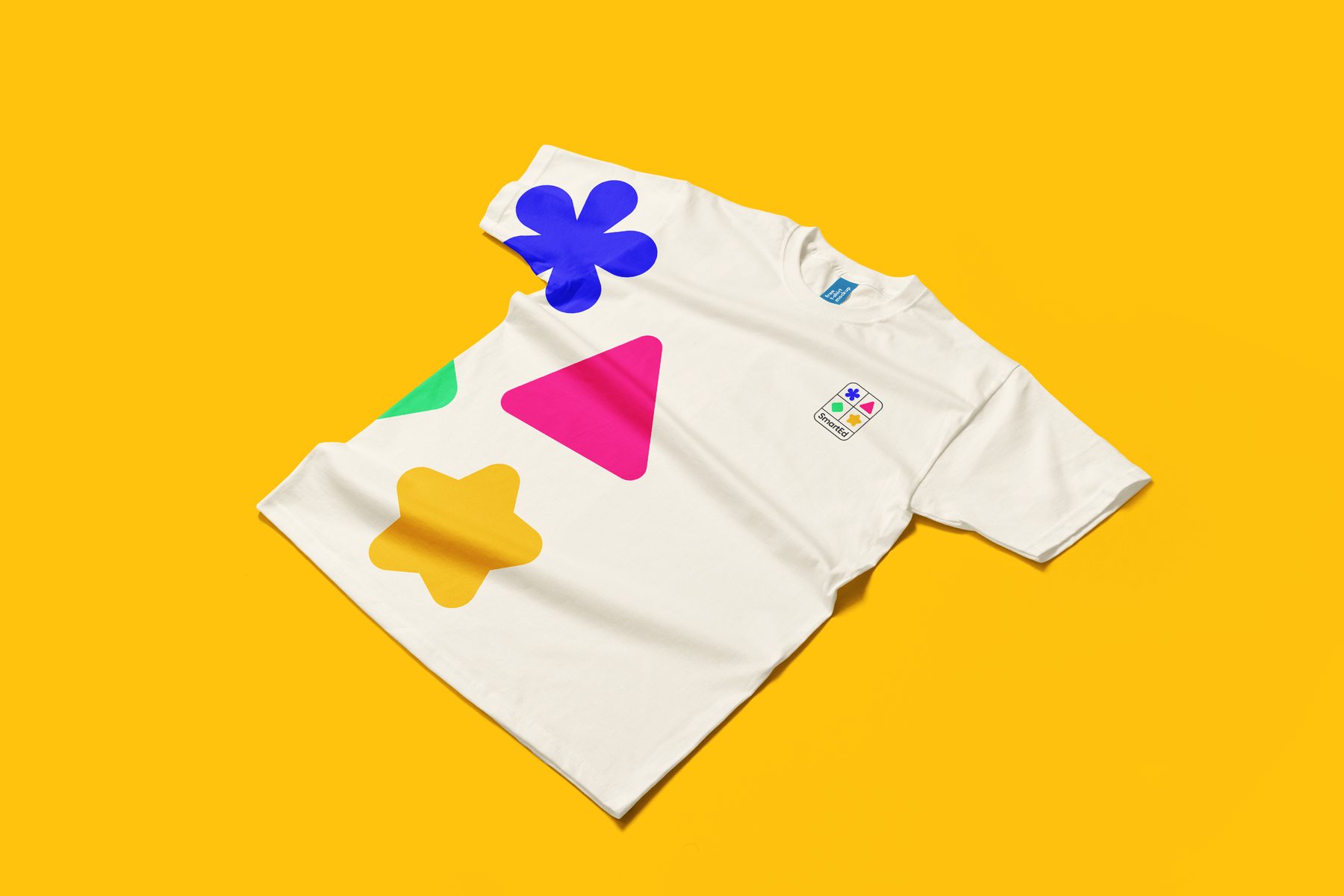
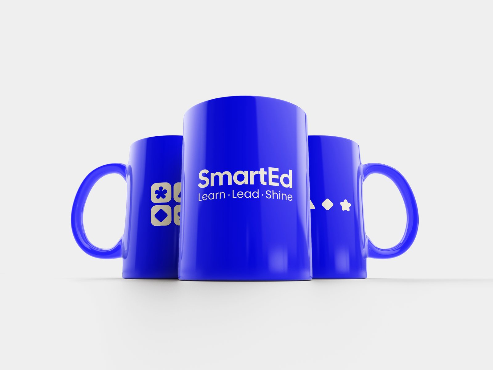
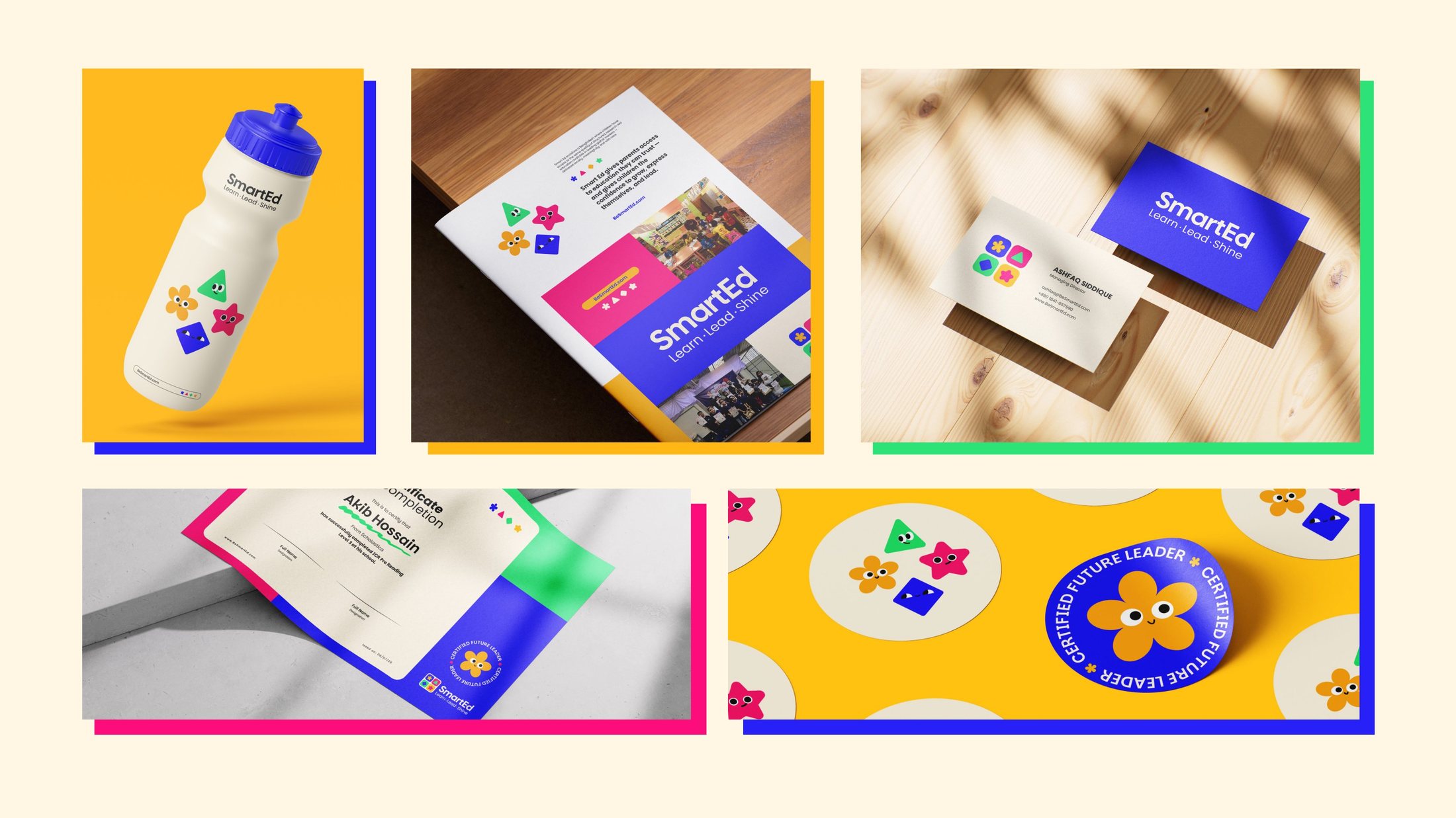
The system was applied across a learning centre, print collateral, merchandise, certificates and a social media programme, giving the team ready-to-use templates from launch day.
A feed that feels like the classroom.
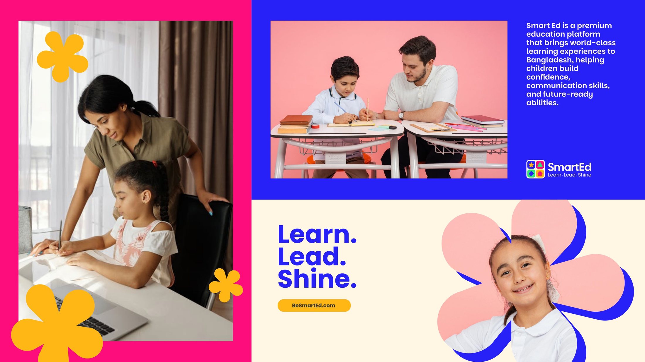
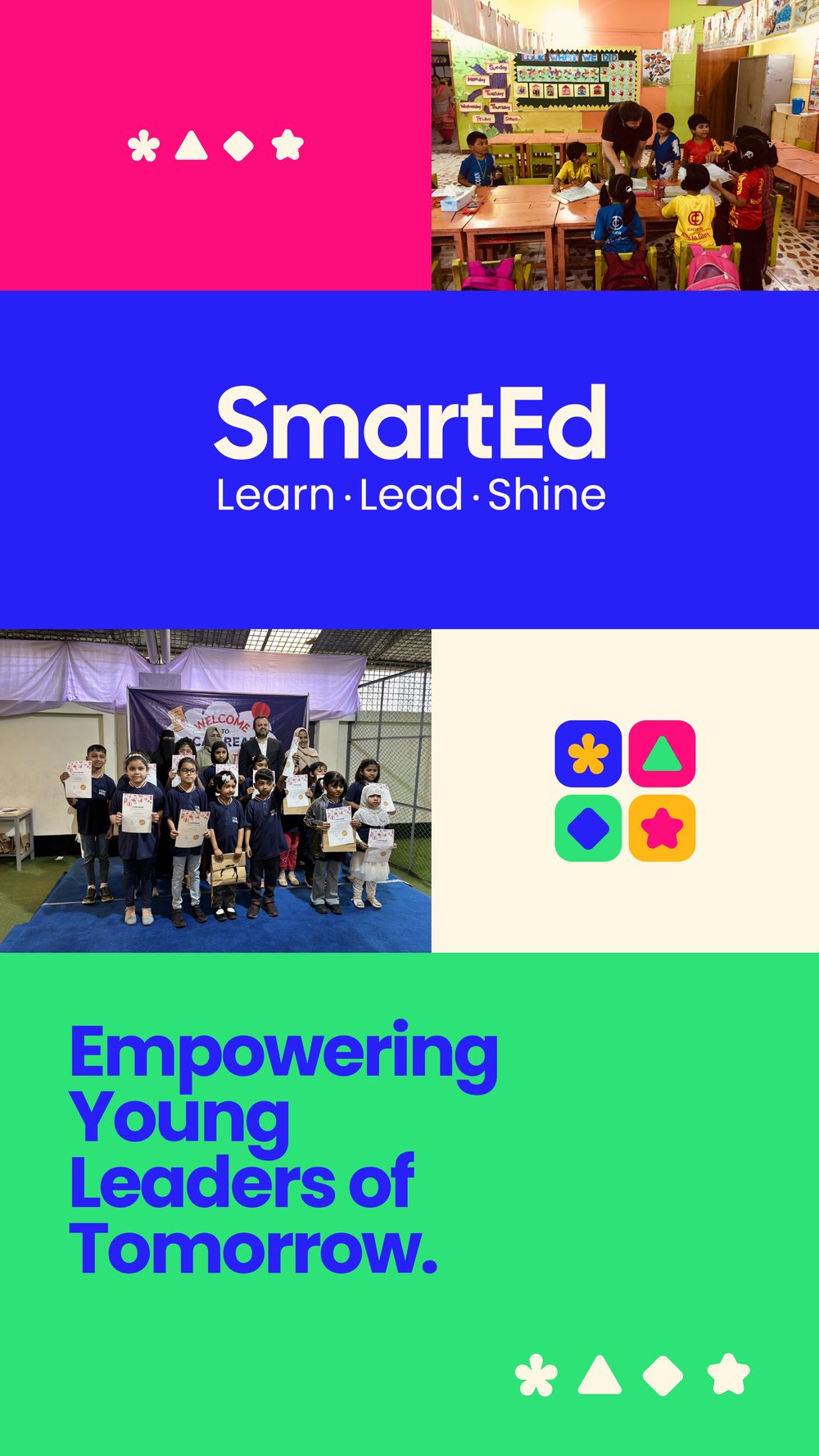
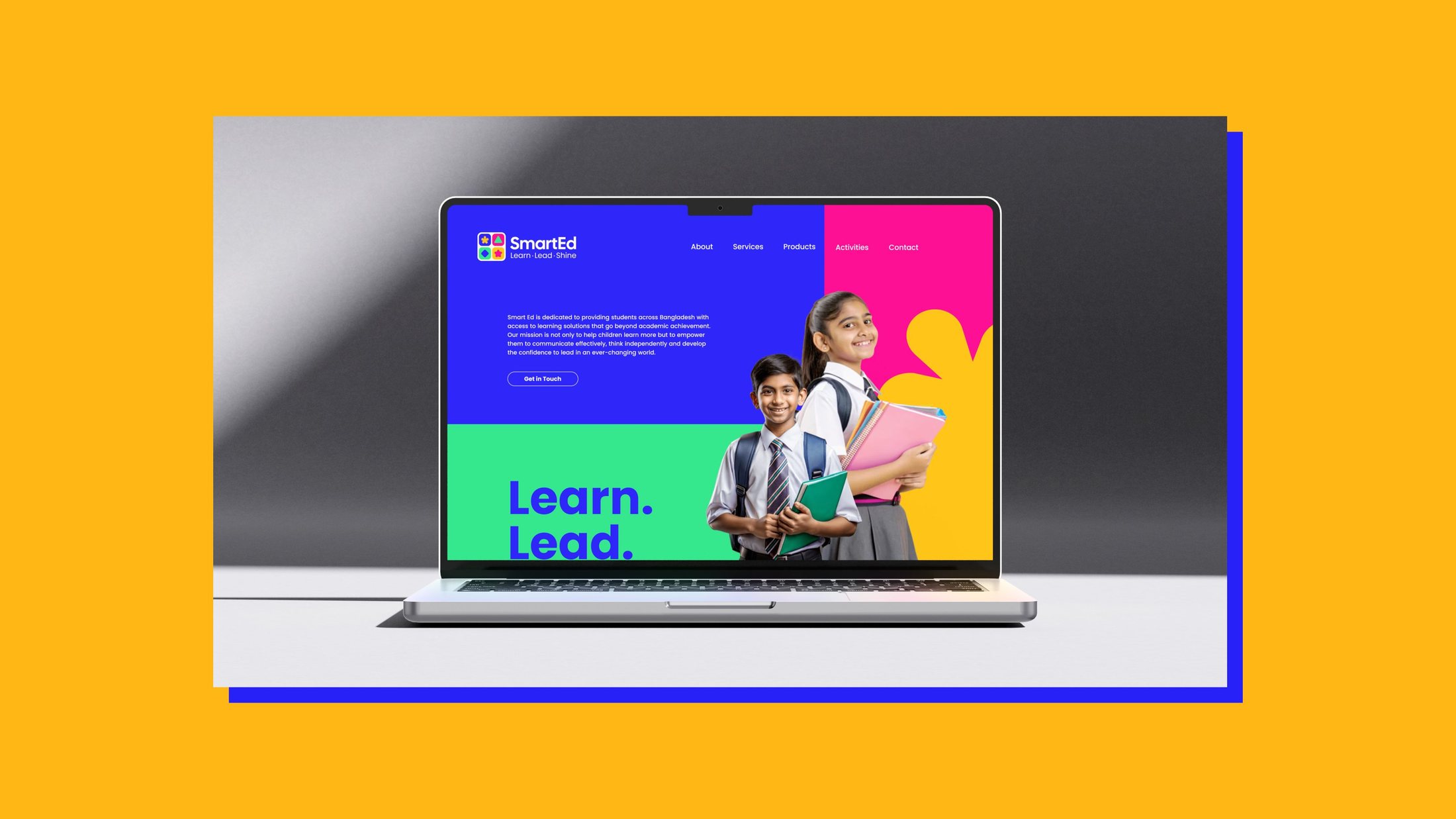
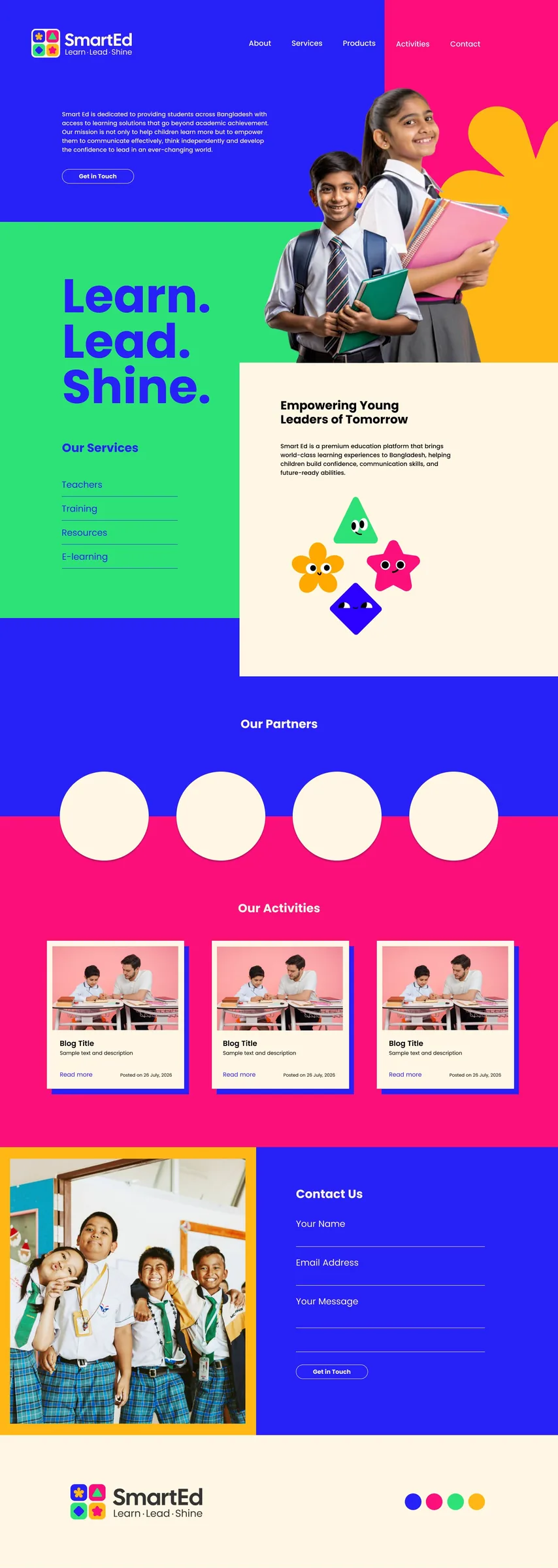
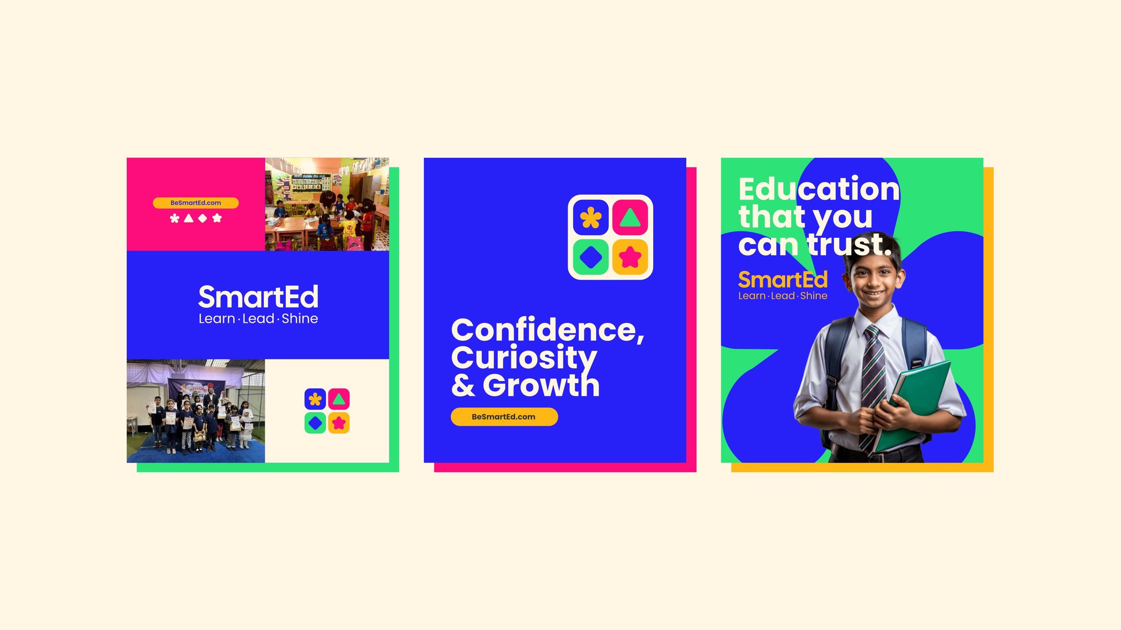
Social templates mix real classroom photography with blocks of brand colour and short, confident headlines. The landing page carries the same system online, introducing services, partners and activities to parents.
A brand ready to grow.
SmartEd now has a documented brand with a clear strategy, a parent-brand architecture ready for new programmes, a distinctive identity and mascot family, and a full set of applications across print, space, merchandise and social.
It gives the business a single, confident voice for parents, children and future education partners.
- Studio
- The Wider Collective
- Scope
- Brand charter, identity, mascots, applications, social
- Flagship programme
- I Can Read