In The Business Standard Meet the team behind Marvella ↗
The Wider CollectiveStart a project

User experience and interface design

Every unnecessary step is another opportunity to lose someone. We study how people use your website or app, find where they get stuck and design journeys and interfaces that make even complicated tasks feel straightforward.

01

Where do people get stuck?

People rarely leave because a design is ugly. They leave because they can’t find the thing they came for, a label doesn’t mean what they expected or a form asks something they can’t answer yet. These problems are easy to miss from the inside, and easy to see once you watch someone use the product.

  • Too many choices on one screen
  • Labels written in the company’s words
  • A question asked before it can be answered
  • No clear next step
02

What the work covers

  1. 01

    Find out what people are trying to do

    We start with the people using the product and the tasks they came to complete. On an insurance website, a traveller wants a premium, a policyholder wants to make a claim and a shareholder wants a report. Each arrives with a different question and a different level of patience.

    You review the main audiences, their tasks and where the current experience is getting in their way.

  2. 02

    Map the journeys

    For each task, we map the steps from arrival to completion and remove the ones that don’t need to be there. Where a decision is unavoidable, we ask for it at the point people can answer it, and we show what happens next.

    You review journey maps and wireframes for the main tasks.

  3. 03

    Design the interface and interactions

    We design the screens, controls and feedback people see along the way. Labels use the visitor’s words. Inputs show their effect straight away, so someone can change an answer and see what it changes.

    You review interface designs and a prototype of the key interactions.

  4. 04

    Test and refine

    We put the prototype in front of people who match the audience and watch where they hesitate. The changes that come out of testing are usually small: a clearer label, a different default, a step moved later. Together, they make the difference.

    Illustrative example

    You review test findings and the revised designs.

03

From the portfolio

paramountinsurance.com.bd
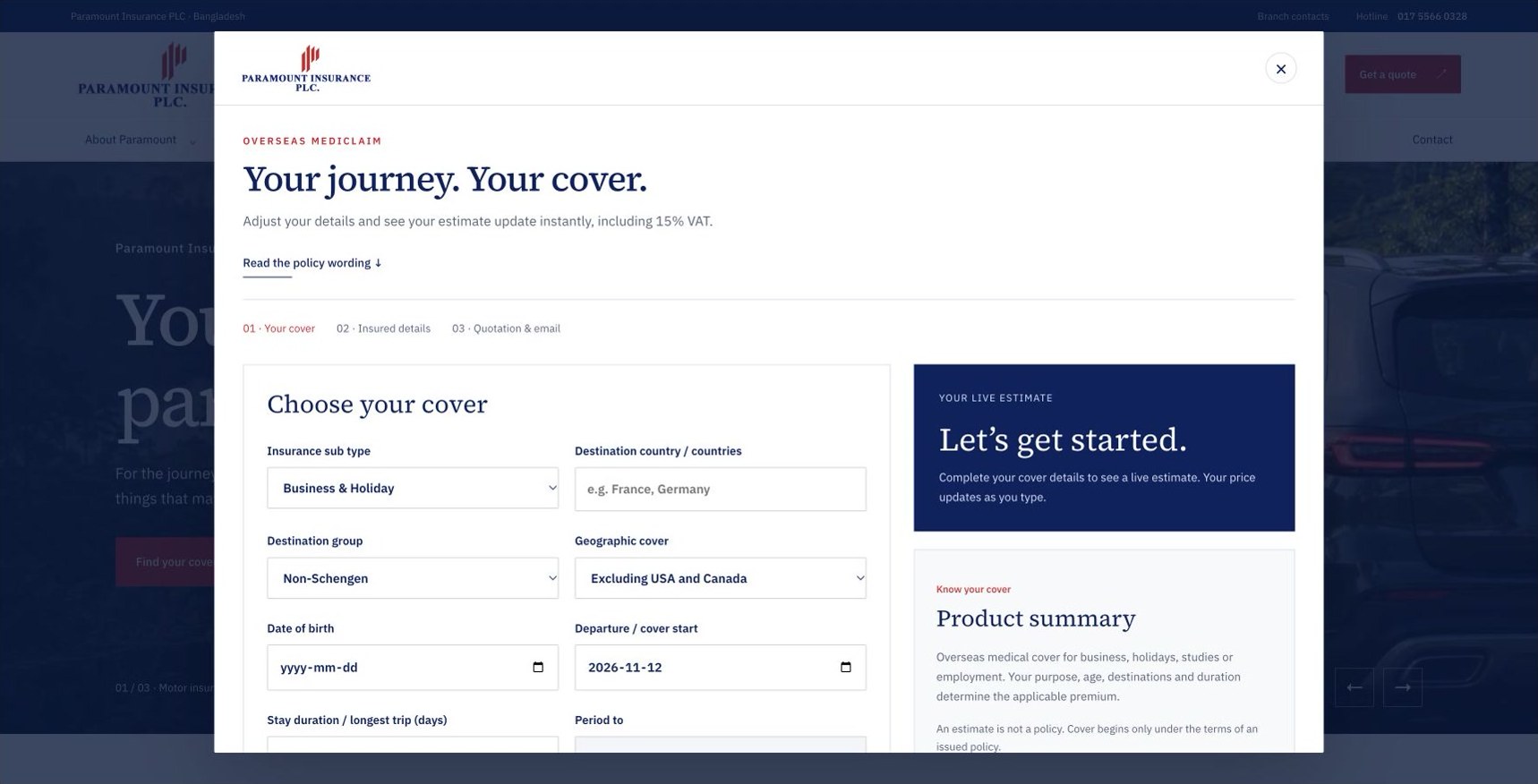
Overseas mediclaim estimator
paramountinsurance.com.bd
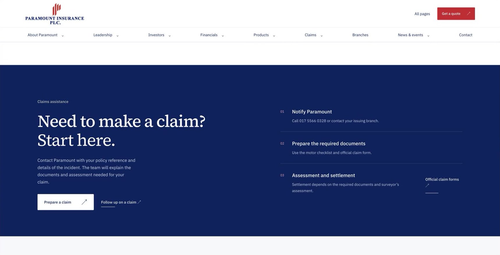
Claims: Need to make a claim? Start here.
paramountinsurance.com.bd
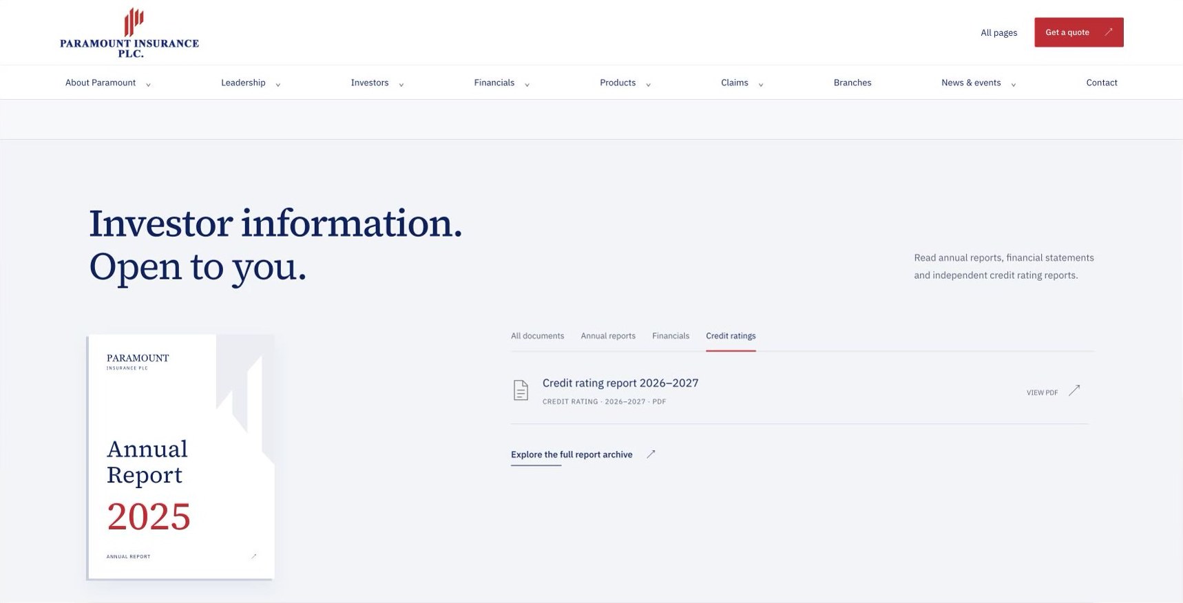
Investor information filtered to credit ratings
Paramount Insurance

Three visitors, three routes

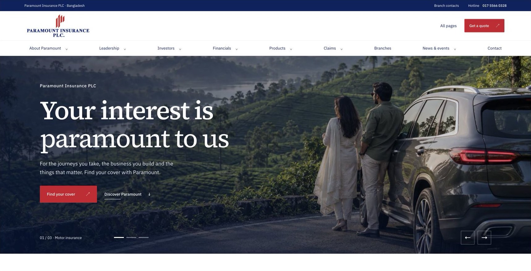
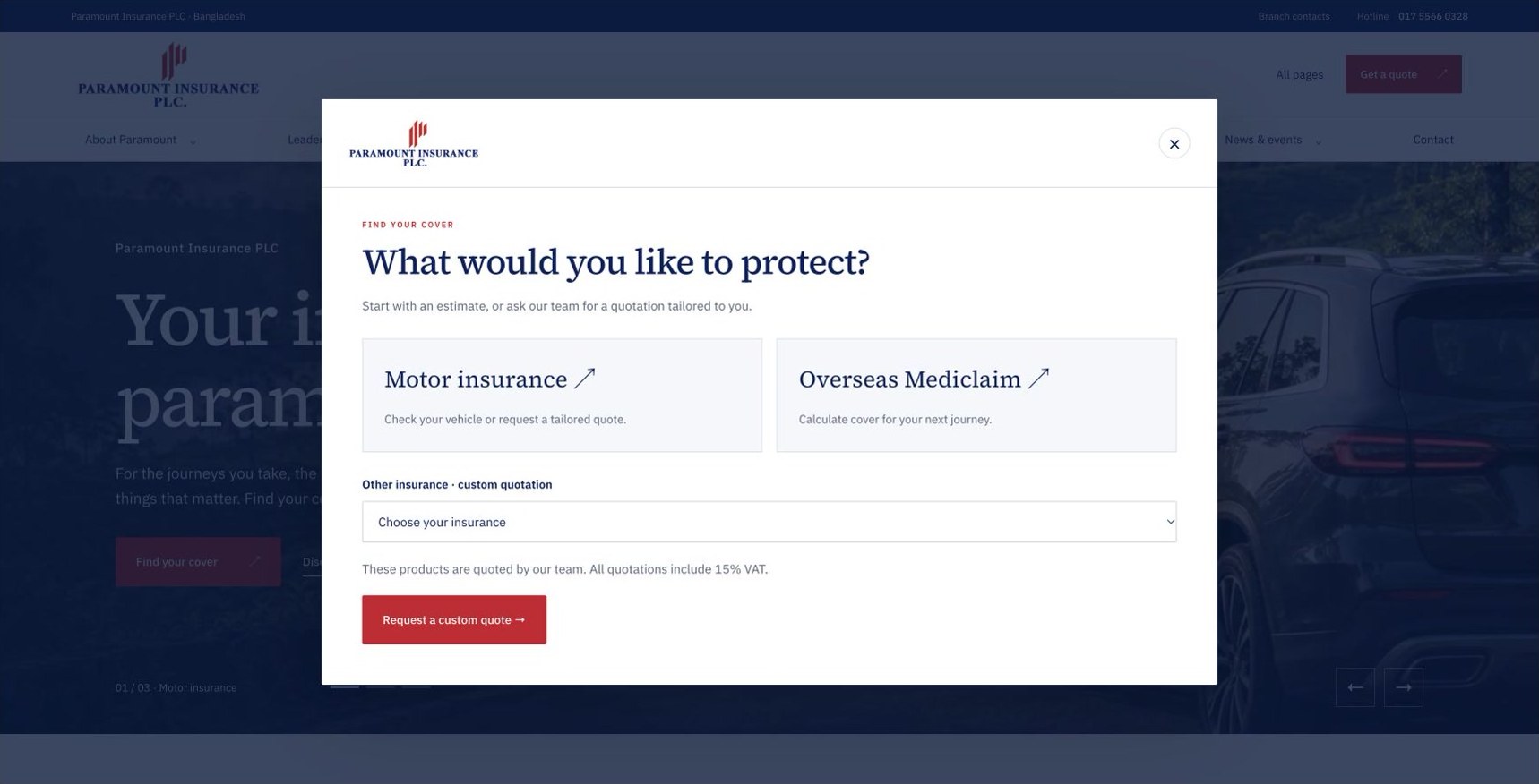
Paramount’s website is organised around what each visitor came to do. The quote journey opens with “What would you like to protect?” For overseas travel, the estimate sits beside the trip details, so a traveller can change an answer and see how it affects the premium. Claims start with one clear prompt. Investor documents can be filtered by type.

Explore the Paramount website
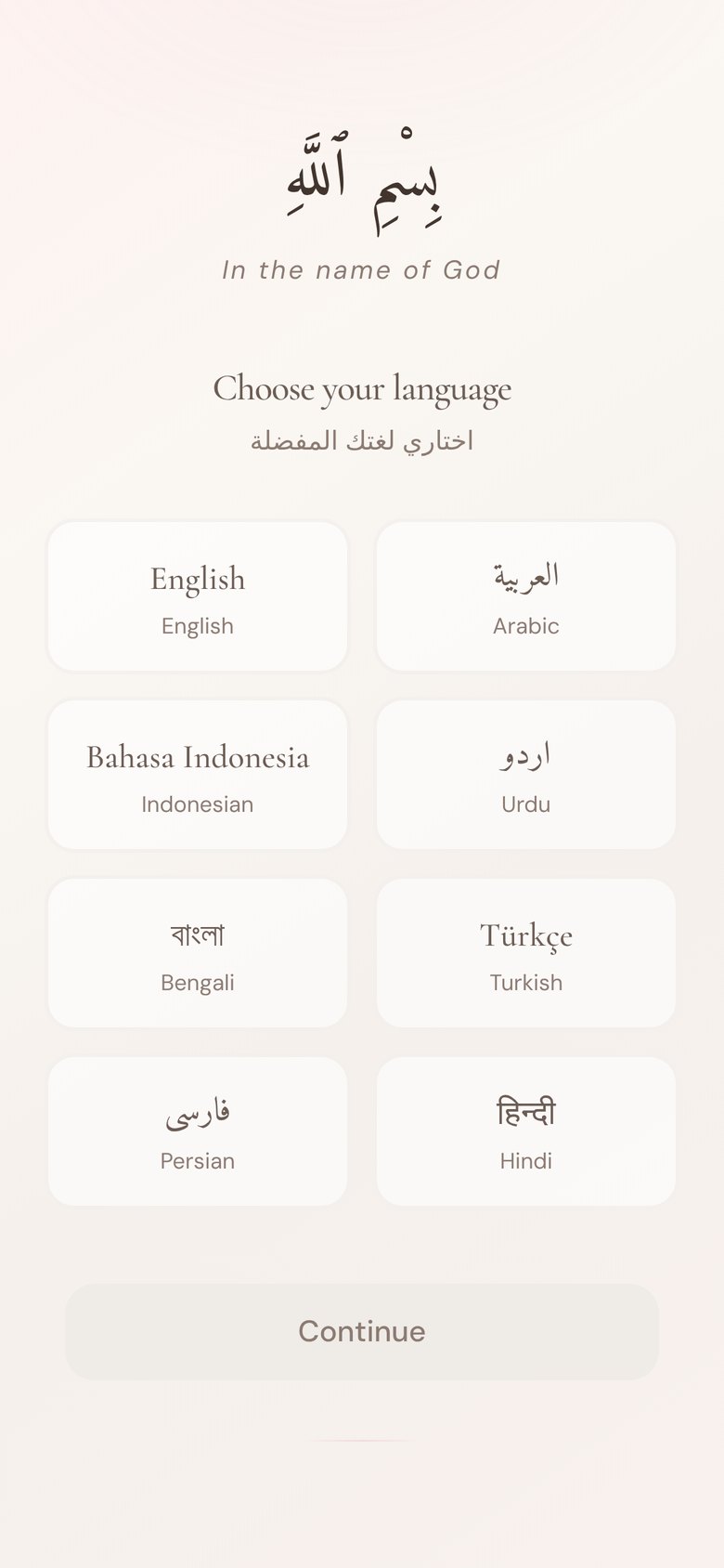
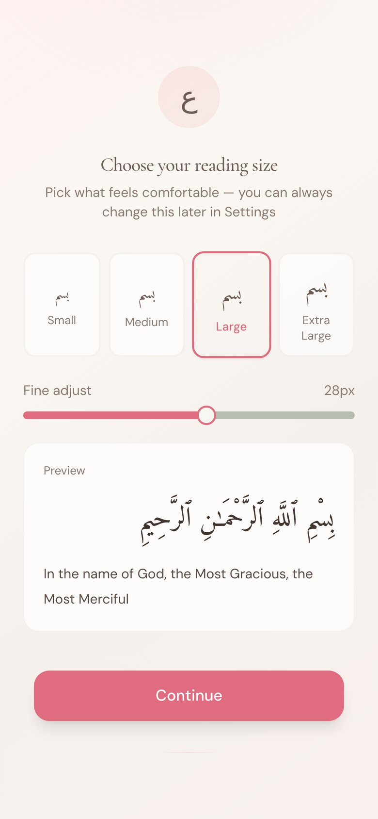
Choose your language
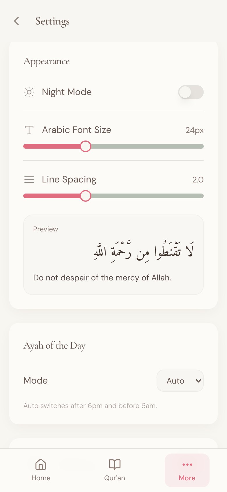
Choose your reading size
Quran4Women

Setting up the app in two choices

Quran4Women asks for two things when it first opens: the language and a comfortable reading size, with a preview of a verse at the chosen size. Both can be changed later in Settings, so neither choice has to be perfect.

Explore Quran4Women
The Cube
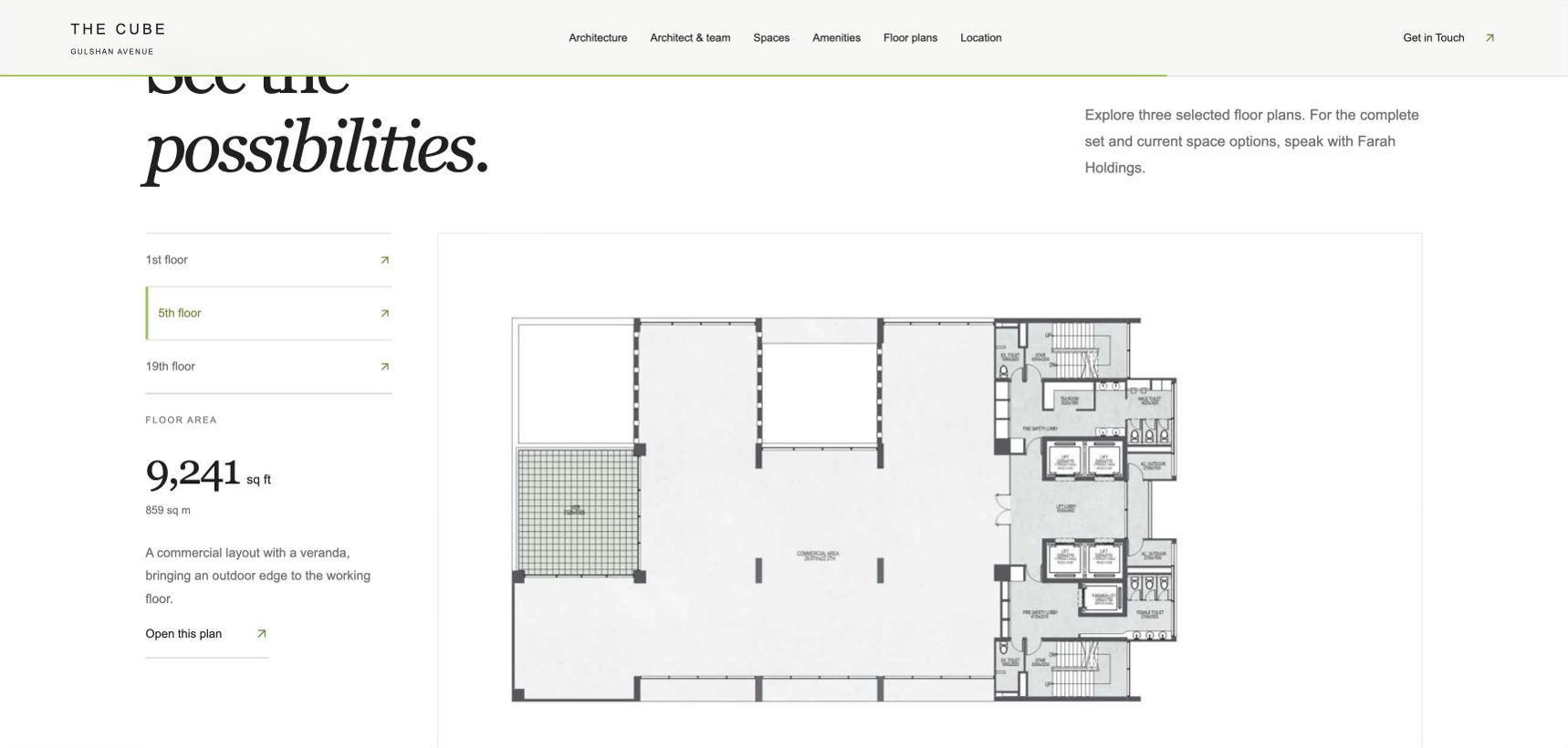
Fifth-floor plan
The Cube
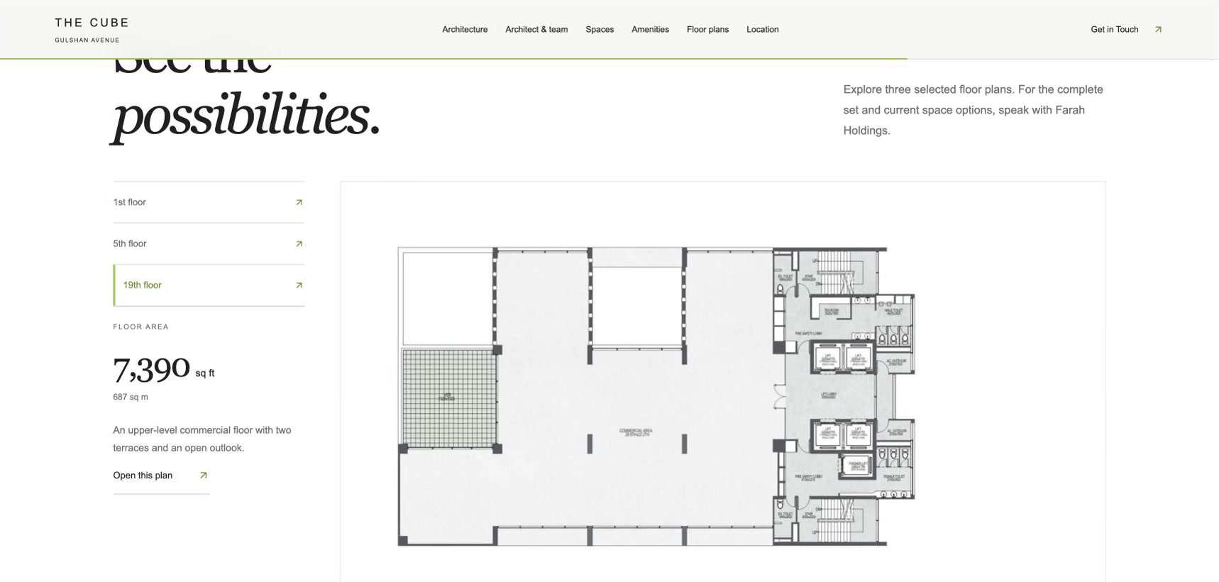
Nineteenth-floor plan
Farah Holdings · The Cube

Comparing floors before a visit

The Cube’s floor-plan selector brings a big decision down to one level at a time. Selecting the fifth floor shows its plan and floor area. Switching to the nineteenth changes both the drawing and the figure.

Explore The Cube
04

What you leave with

05

Common questions

We already have a website. Can you improve it without starting again?

Often, yes. We can review the current experience, find where people get stuck and redesign those journeys first. A full rebuild is only worth it when the structure itself is the problem.

Who do you test with?

People who match your audience. Depending on the product, that might be your customers, your staff or recruited participants. A handful of sessions usually shows the main problems.

Do you work on internal tools as well as public websites?

Yes. Dashboards, booking tools and back-office systems need the same care. The people using them every day notice every unnecessary step.

Where are your users getting stuck?

Tell us what the product is, who uses it and which task you most want to make easier. If you already have analytics, support tickets or complaints, bring them along.

Talk to TWC about UX and UI design ↗
More in Websites & digital products
Website and app designResponsive websites and e-commerceDigital product and full-stack development
← Back to Websites & digital products