MEV
One brand, from the first headline to the specifications
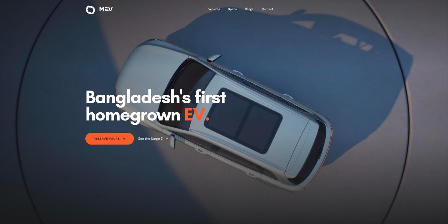
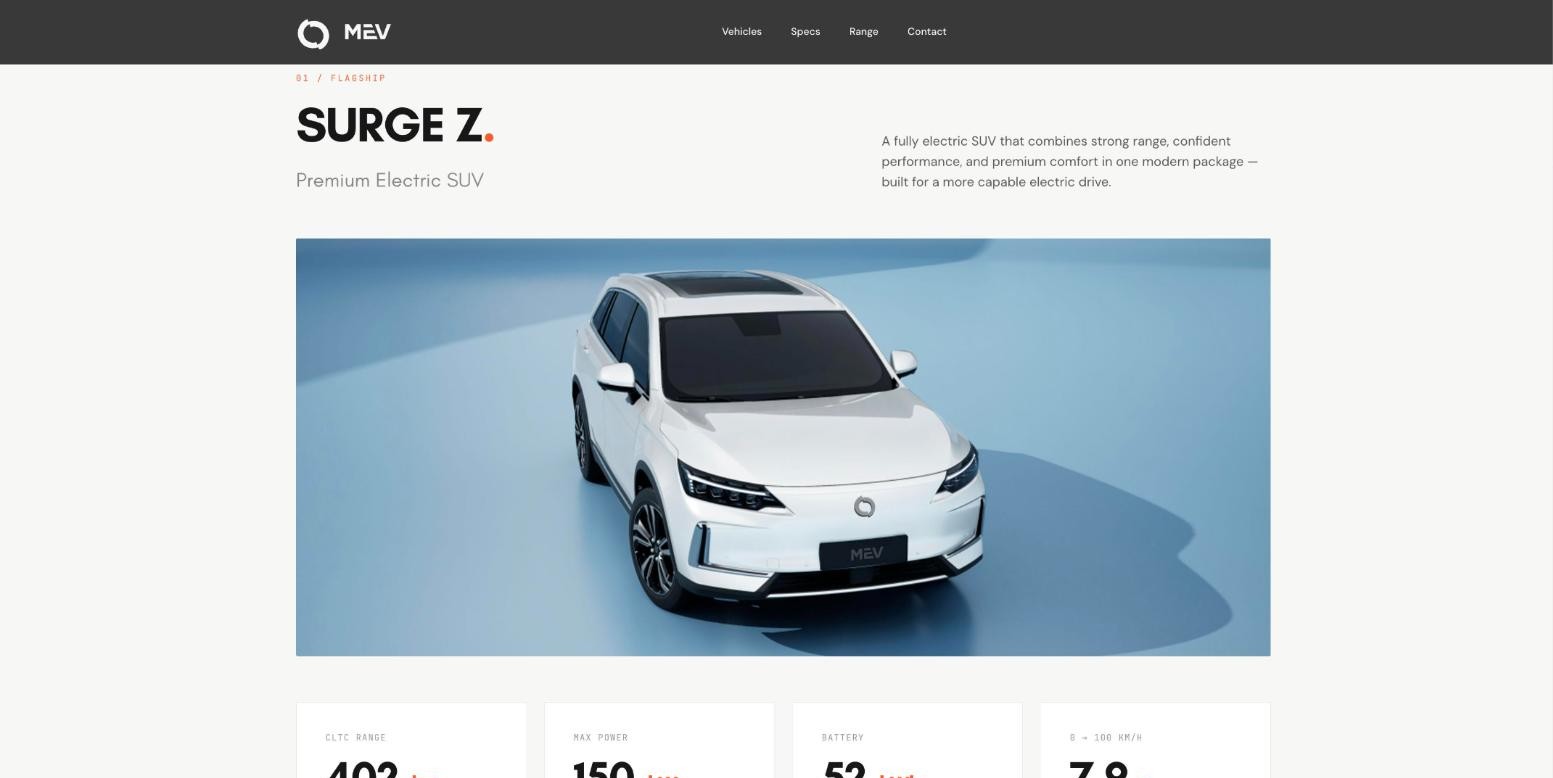
MEV’s website moves from a full-screen hero to the detail of each vehicle. The Surge Z section brings range, power, battery and acceleration into a row of four figures.
Explore MEV Start a project
Your customers move between screens. Their experience should move with them. We build responsive websites and online stores that load quickly, work for everyone and feel the same whether someone is browsing on a phone or buying on a laptop.
The same person might find you on their phone during a commute, compare options on a laptop at work and come back on a tablet in the evening. A responsive website isn’t a desktop site squeezed onto a smaller screen. Each layout is planned for how people use that screen.
A wide screen can show several things side by side. A phone shows them one after another. We decide the order for each layout so the most important content and the main action stay near the top, wherever someone is reading.
You review page layouts for phone, tablet and desktop.
Pages should load quickly on a phone connection. We size images for the screen they appear on, load video only where it earns its place and keep the code lean. We check performance as we build, not at the end.
You review performance results for key pages on a mobile connection.
We build for people using keyboards, screen readers, zoomed text or a phone in bright sunlight. That means enough contrast, real buttons and labels, sensible headings and motion that can be turned down.
You review an accessibility check of the main templates.
For e-commerce, we design the product pages, cart and checkout around what a buyer needs at each point: the details to decide, the total to confirm and as few form fields as possible. Your team gets an admin they can use to manage products, prices and orders.
You review the product, cart and checkout flow, and the admin your team will use.
MEV’s website moves from a full-screen hero to the detail of each vehicle. The Surge Z section brings range, power, battery and acceleration into a row of four figures.
Explore MEV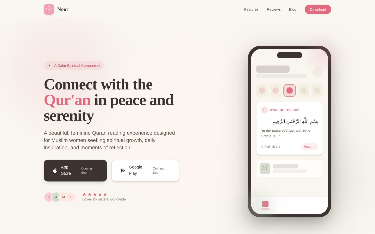
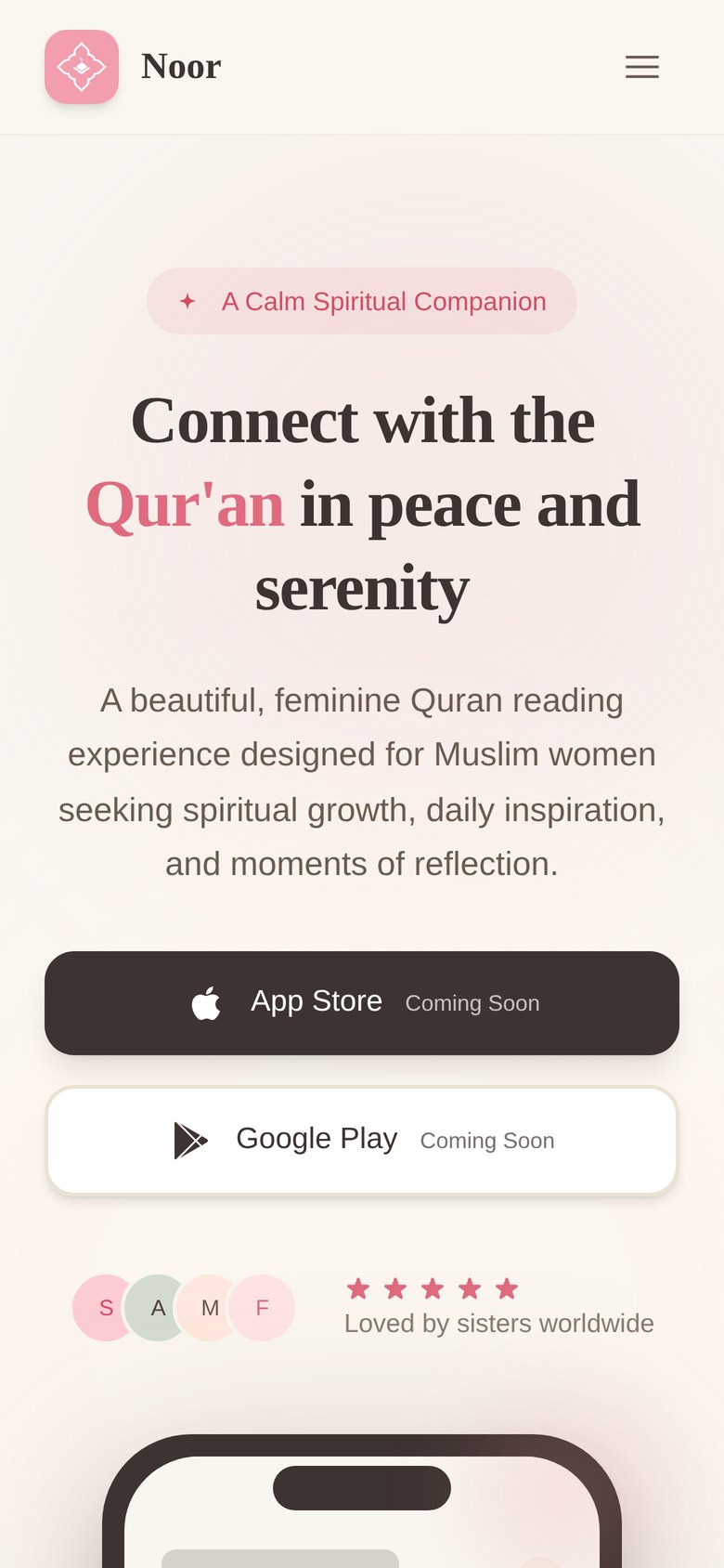
On a desktop, quran4women.com places the headline and the app side by side. On a phone, the headline comes first, the download buttons follow and the app preview moves below.
Explore Quran4WomenThe Cube’s website carries an architectural film, tabbed workspace views and an interactive floor-plan selector. Each had to work on a phone as well as a large screen, without the film slowing the rest of the page down.
Explore The CubeBuilt and tested on phones, tablets and desktops.
An admin your team can use to update pages, products and images.
Results for the main templates before launch.
Hosting, domains, analytics and redirects set up and handed over.
It depends on what you need to manage after launch. A brand or campaign site can be a lightweight custom build. A store with many products may be better on a commerce platform such as Shopify. We recommend one before the build starts and explain why.
Yes. We set up the content management your team needs and show them how to use it. We can also stay on for updates and improvements.
We can set up hosting, domains, analytics and redirects from an old site, or work with your IT team if you already have those in place.
Tell us whether it is a new website, a rebuild or an online store, and what your team will need to manage after launch. If there is a site already, send the link.
Talk to TWC about your website ↗