Connect. Explore. Save.
A travel identity for a booking platform built to connect people across South Asia.

Tripper sells buses, trains and flights at prices young travellers can say yes to. The brand had to feel as quick and light as the trip it was selling, and still look dependable enough to hand your money to.
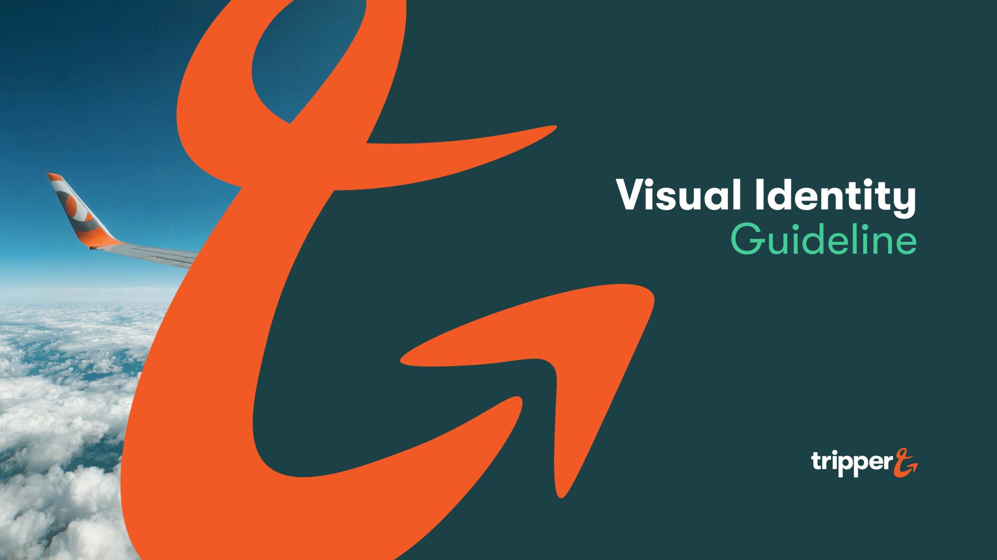
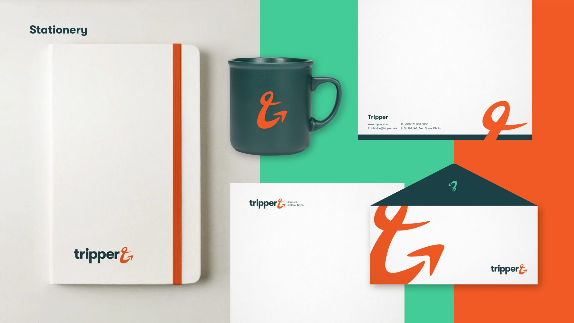
The Wider Collective built the identity and wrote it down in a visual identity guideline: the logo and its variants, an icon that can be cropped and recoloured, a four-colour palette, one typeface, a direction for photography and the first stationery.
Brand overview, from the guideline
To provide budget-friendly, convenient travel options that connect people across South Asia, offering exclusive deals on transportation modes like buses, trains, and flights.
A wordmark with somewhere to be
The wordmark is set tight and heavy so it reads at app-icon size. The last letter breaks away from it: a hand-drawn ampersand that turns into a T and ends in an arrow, the way a plan turns into a trip.
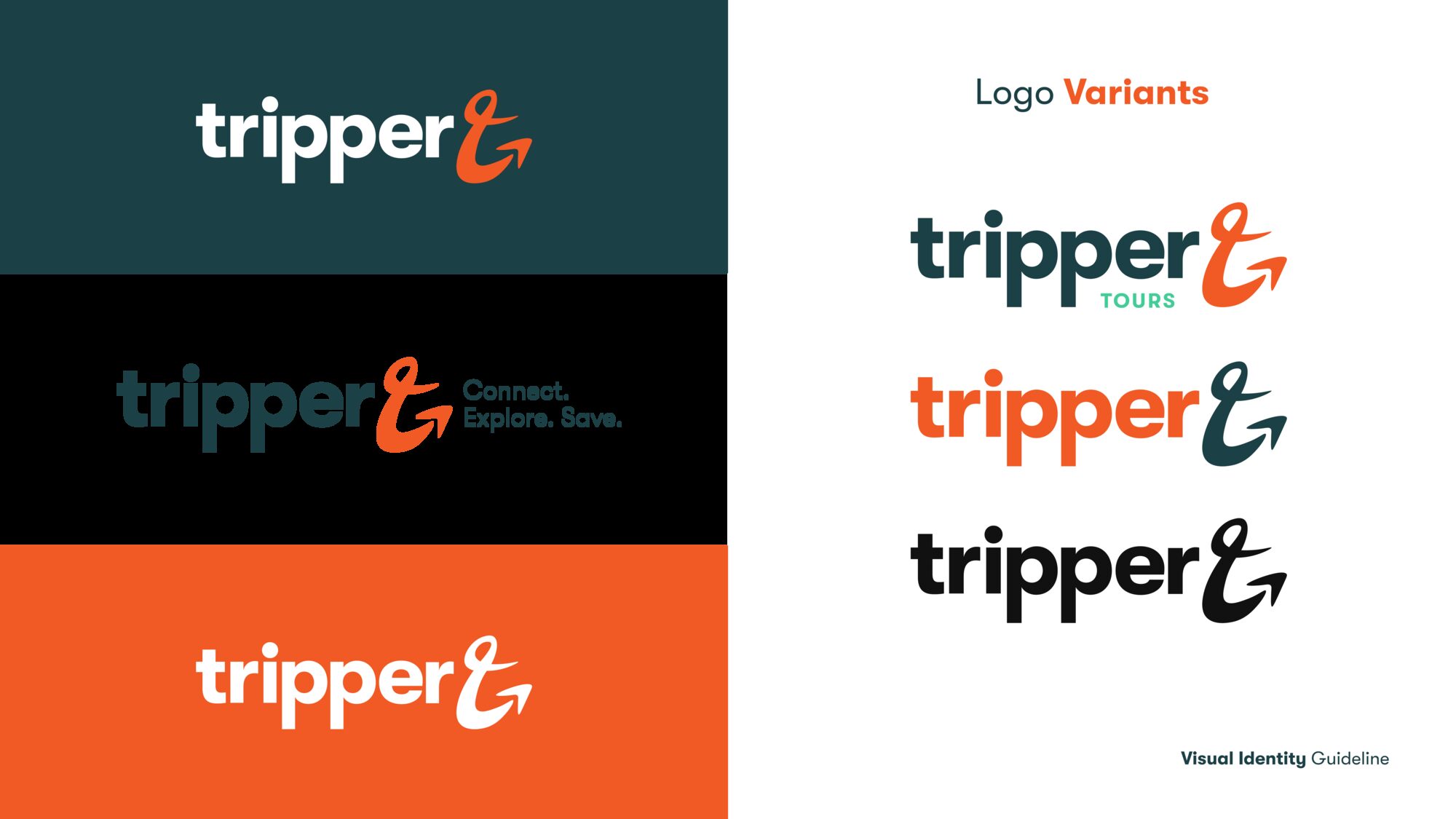
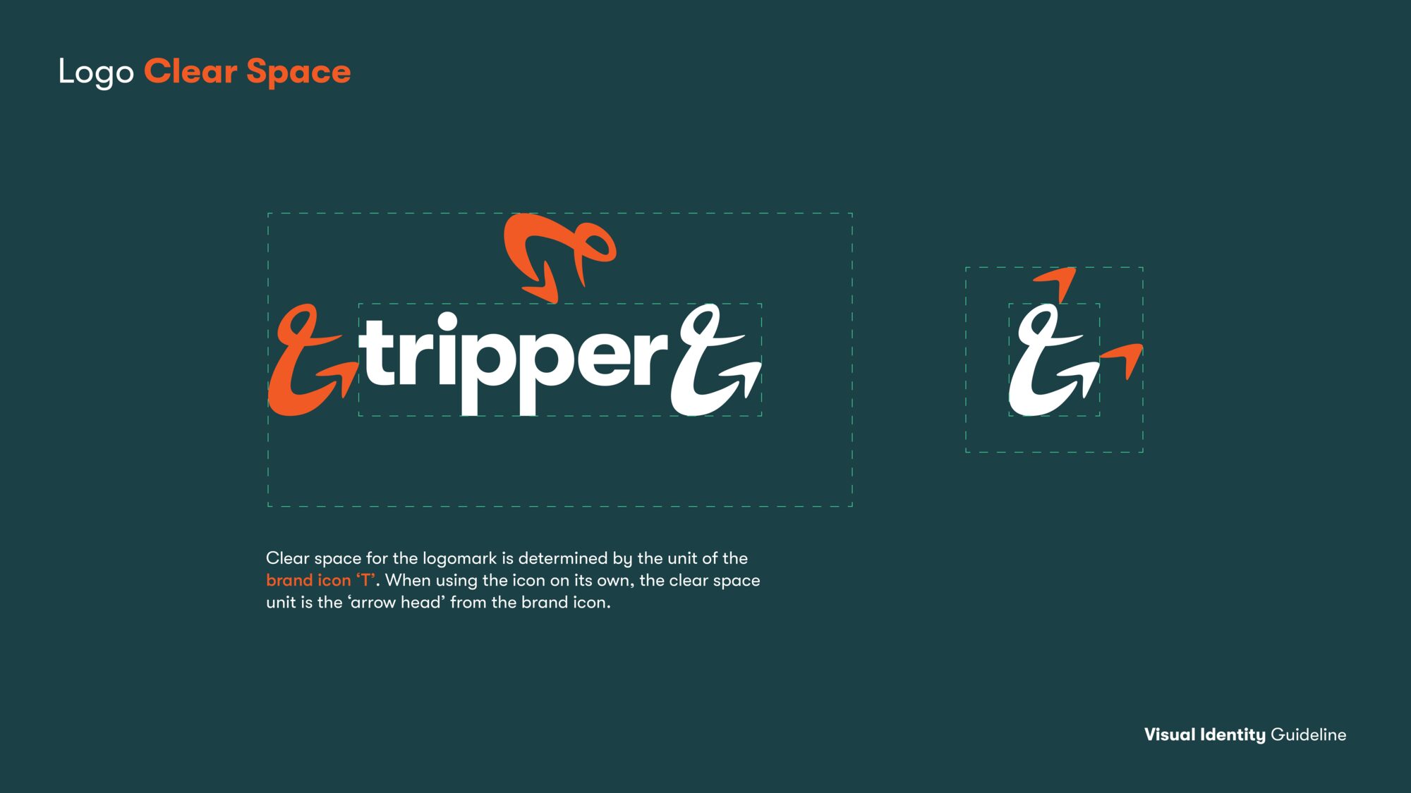
The guideline sets a primary lockup, a version with the line “Connect. Explore. Save.”, a Tripper Tours variant in teal, single-colour versions for print, and clear-space rules taken from the icon itself.

One mark, cropped a hundred ways
Because the icon is a single gesture, it still reads when most of it is off the edge. The guideline shows it cropped into corners, enlarged behind photography and recoloured on every brand colour, so a poster, a story frame and a boarding pass can all carry it without repeating the full logo.




Reliable green, youthful orange
The palette comes from the brand persona the guideline describes: fun, energetic and youthful. Sacramento Green carries the reliability; International Orange and Bright Teal carry the energy. Cold Black is there for the times only one colour is possible.
Photos with a destination in them
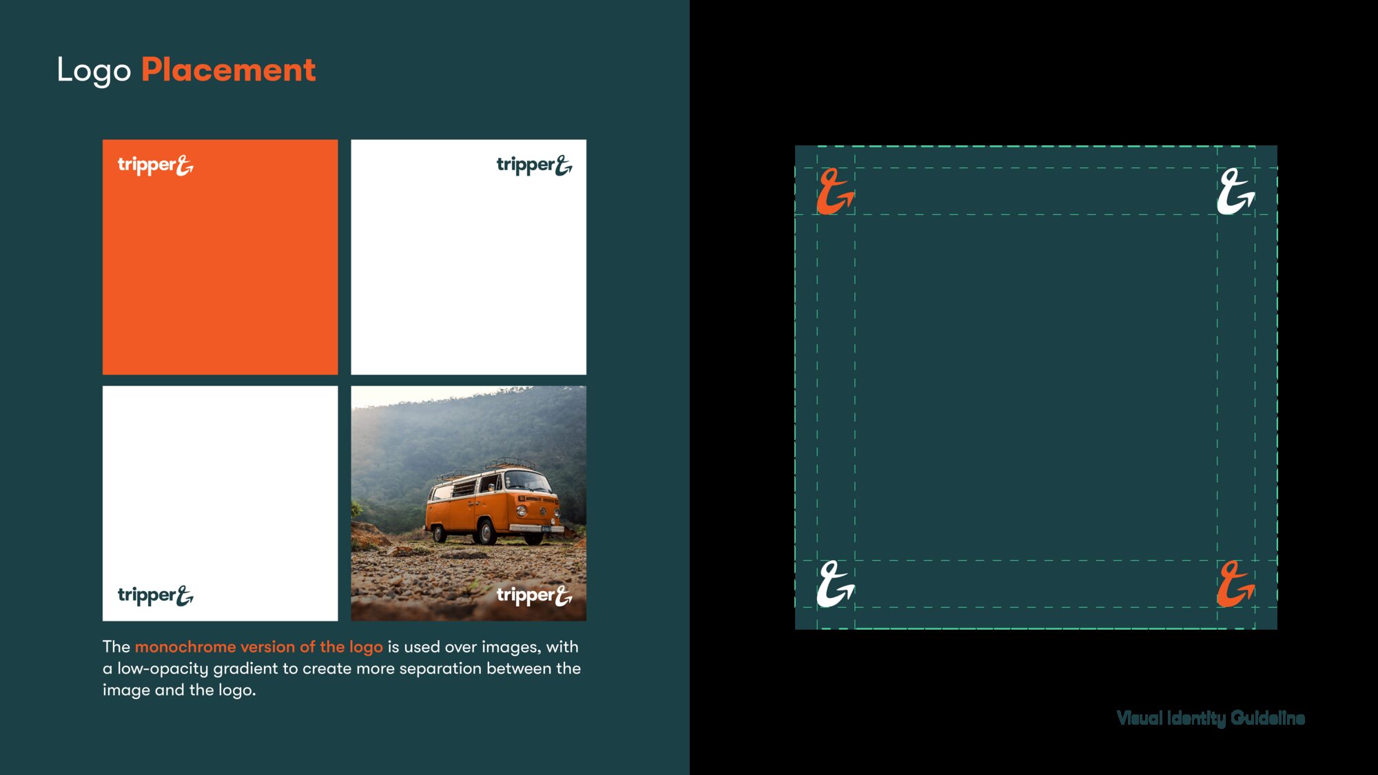
Photography follows the people, not the transport: a van on a hill road, a lake at the end of a hike, a window seat. Images are warm and specific, and they leave room in one corner for the logo or a cropped icon.

From the guideline cover to the business card
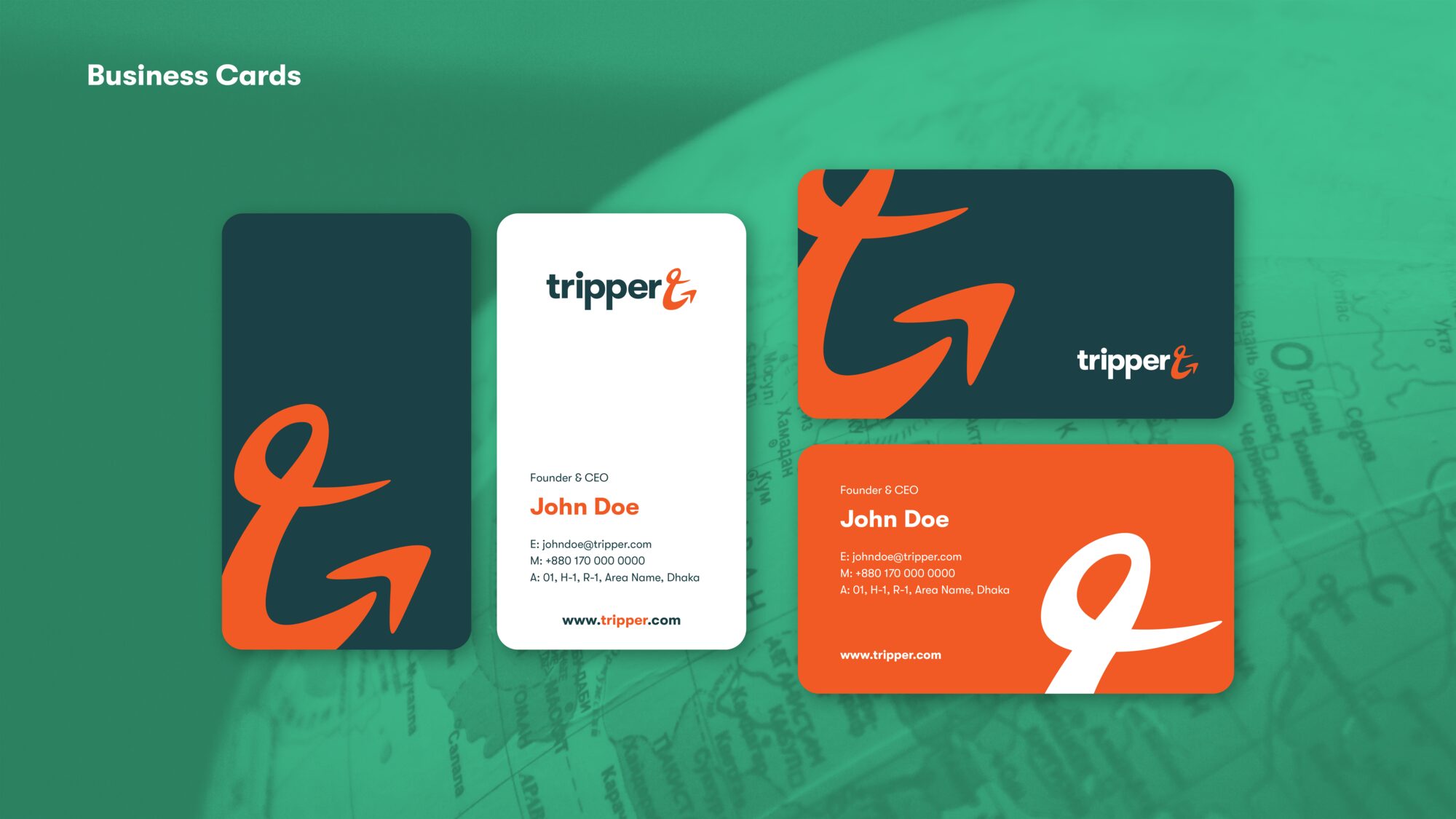
The first applications set the pattern for everything after: a large cropped icon in orange against green, the wordmark small and confident in a corner, and teal used as a wash over photography.