
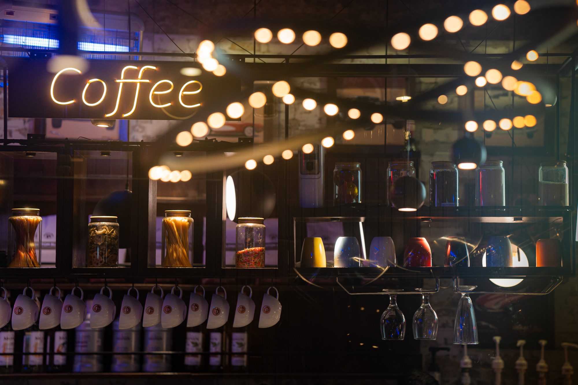
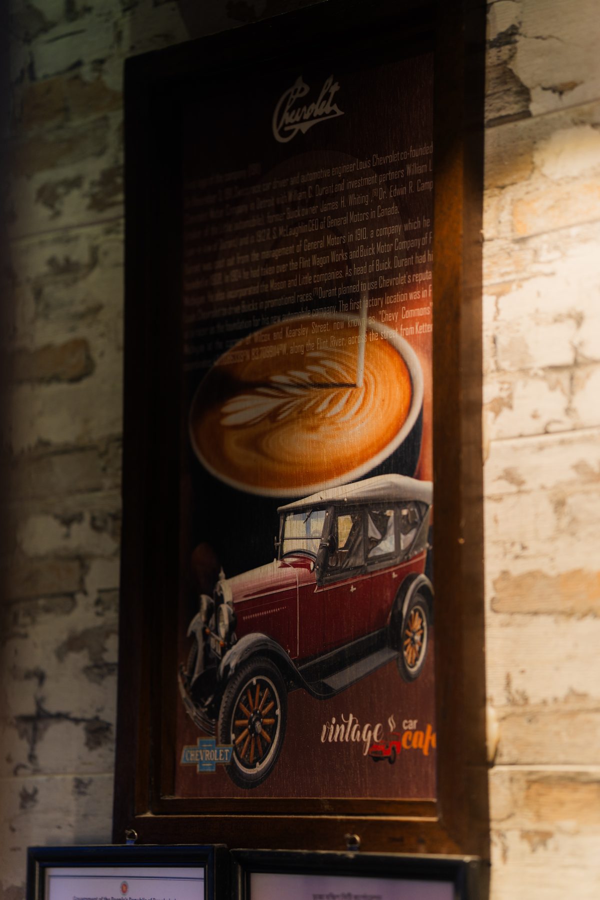
Vintage already had a story people could see on the walls: old cars, a neon “Coffee” sign and a Chevrolet poster beside the espresso machine.
The logo hadn’t caught up with the room. The Wider Collective redrew the brand around the same idea, keeping the classic-car theme but giving the café a mark, palette and set of templates it could use across the menu, social feed, signage and packaging.
From cartoon car to cast badge
The original badge packed a lot into one circle: a red sports car, steam, two typefaces and three colours. It was friendly, but it was hard to reproduce small and it looked like a sticker rather than a sign.
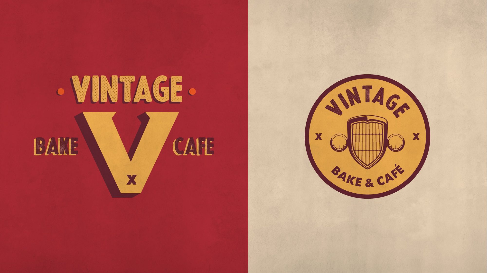
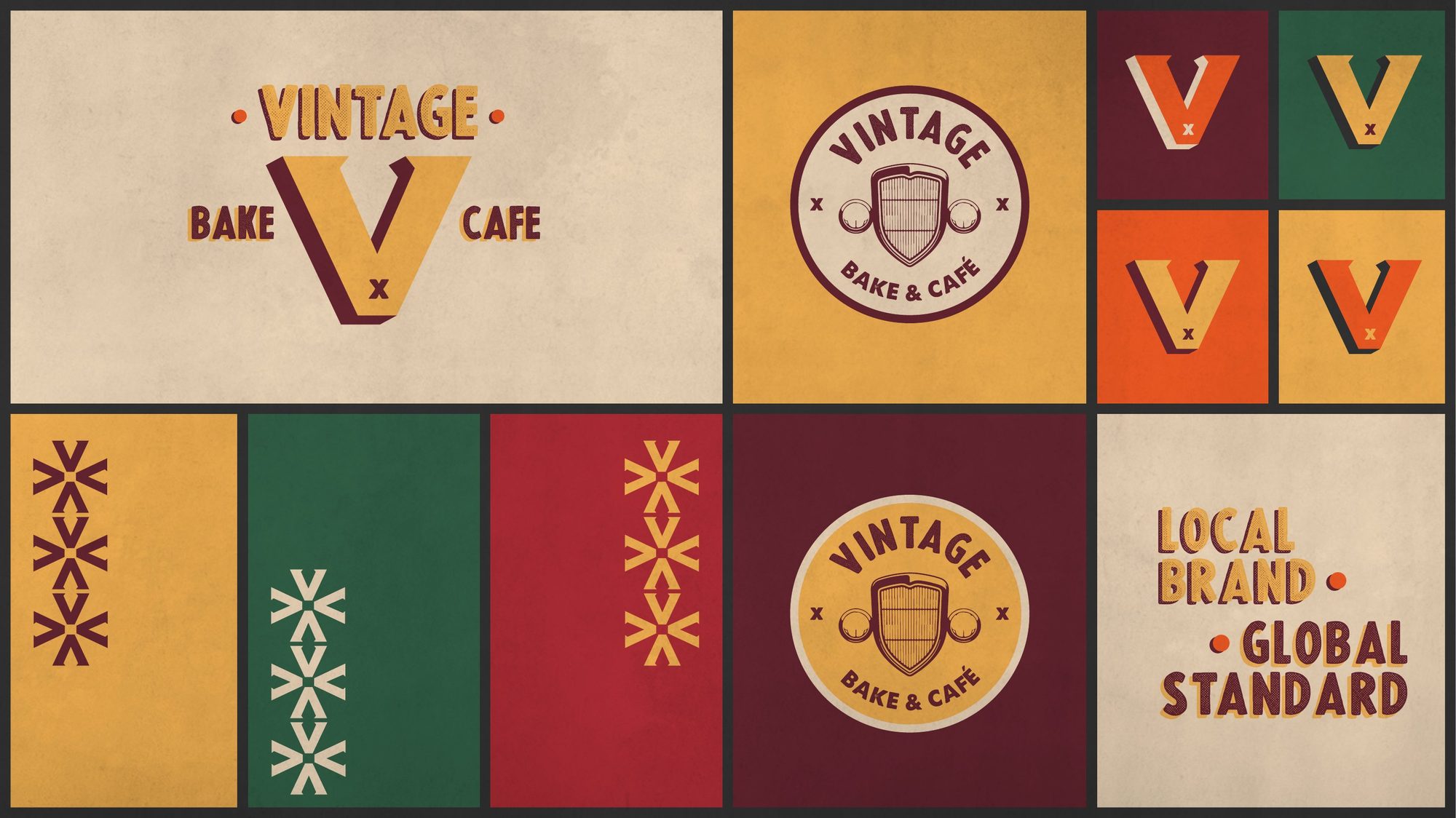
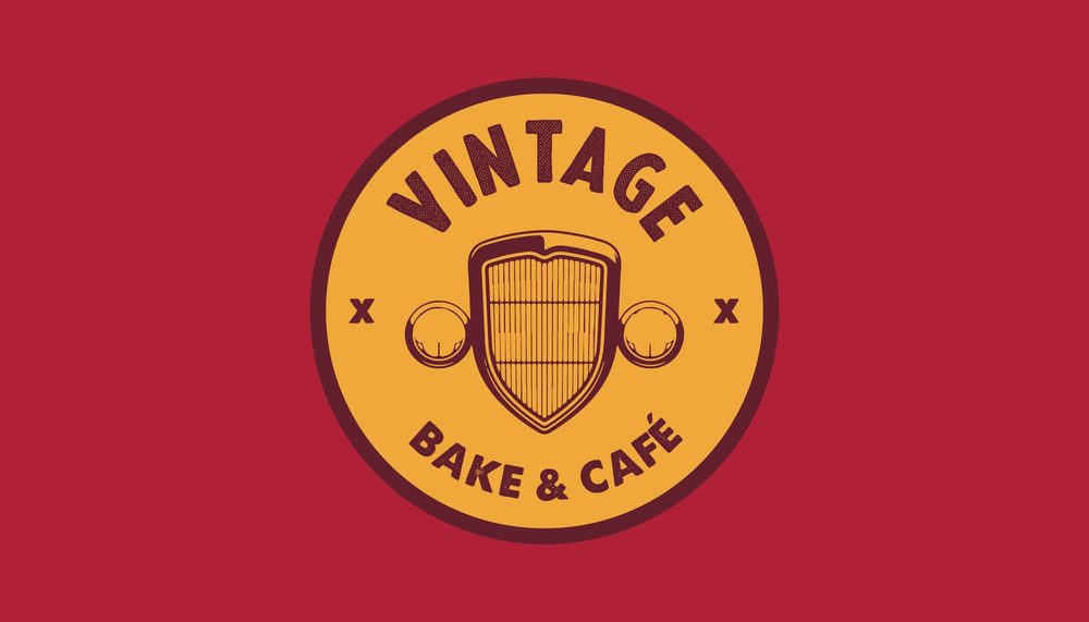
We kept the badge shape and the car, and reduced the car to its grille. The new mark reads like a radiator emblem: one shape, two colours, set inside a mustard roundel with “Vintage” arched above and “Bake & Café” below. A separate V monogram with “Bake” and “Cafe” on either side handles wide formats.
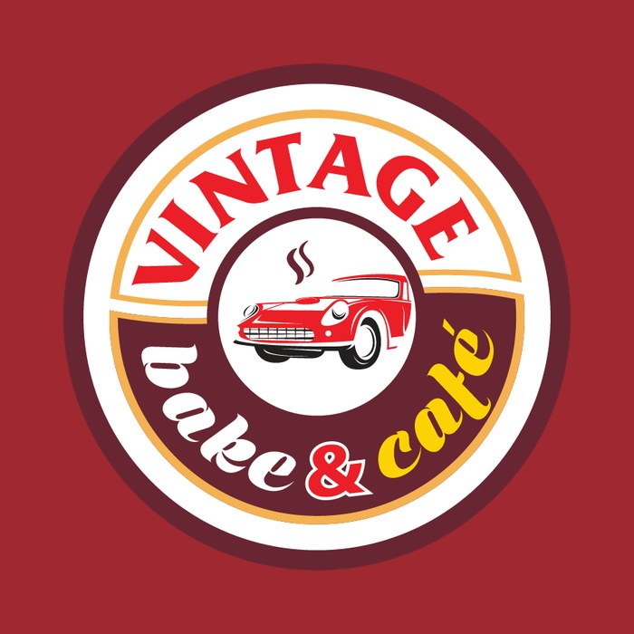 Before
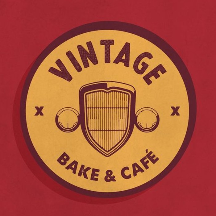 After
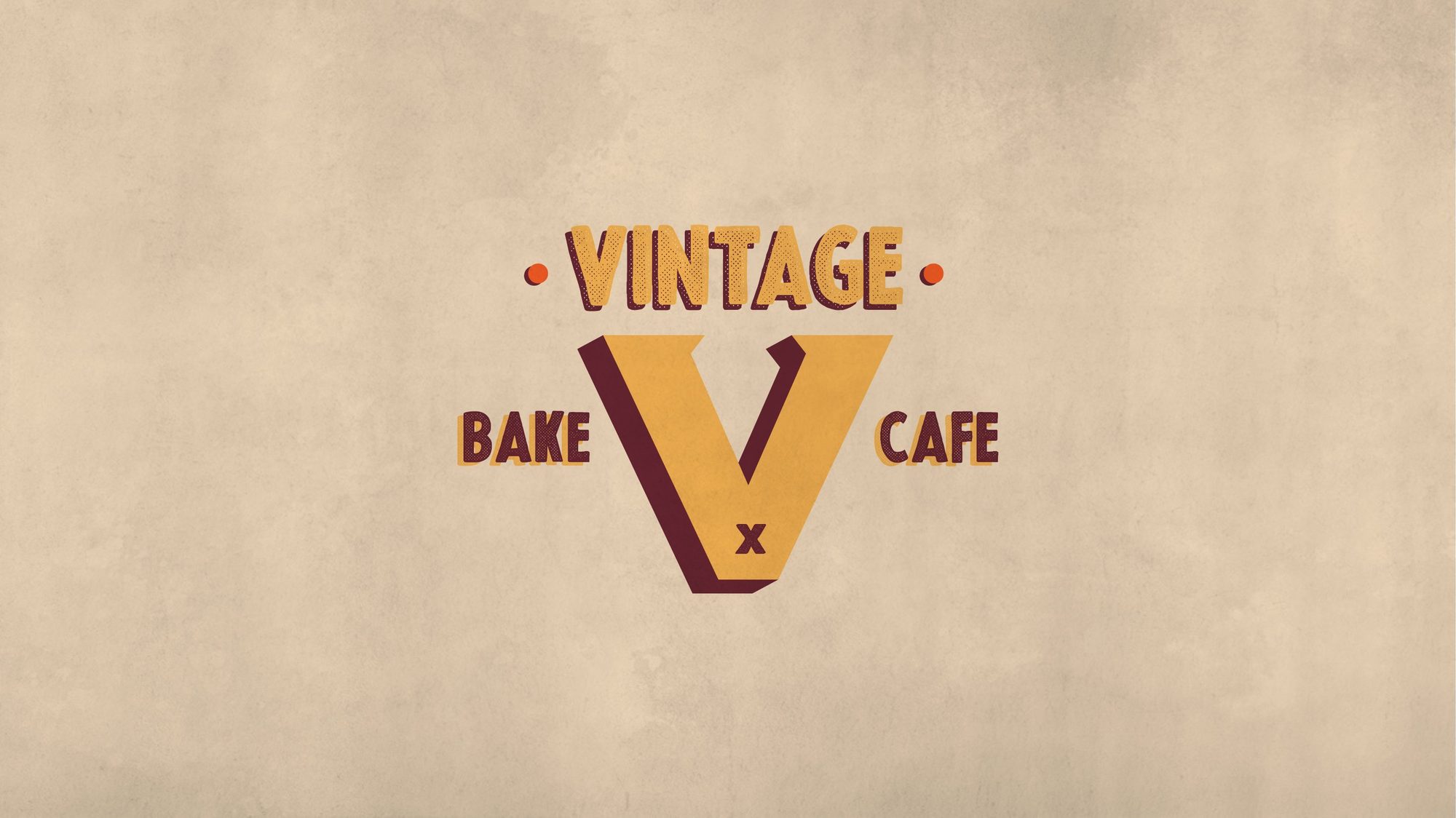
A small kit with a lot of range
The guidelines set out the two marks, a palette of maroon, café red, mustard, cream, bottle green and a burnt orange, and a repeating pattern built from the V. The layouts lean on condensed, poster-style lettering with a hard drop shadow, the kind you would find on an old garage sign.
The final sheet puts the whole kit side by side, along with the line that ties it together: Local brand, global standard.
Templates the café could fill in
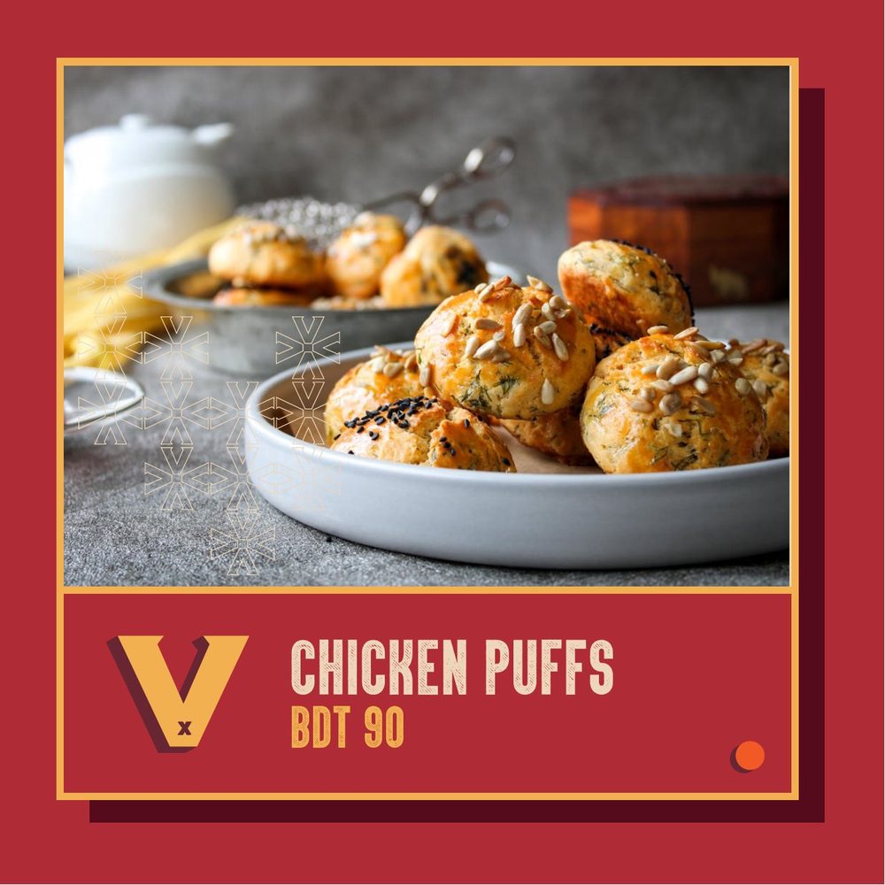
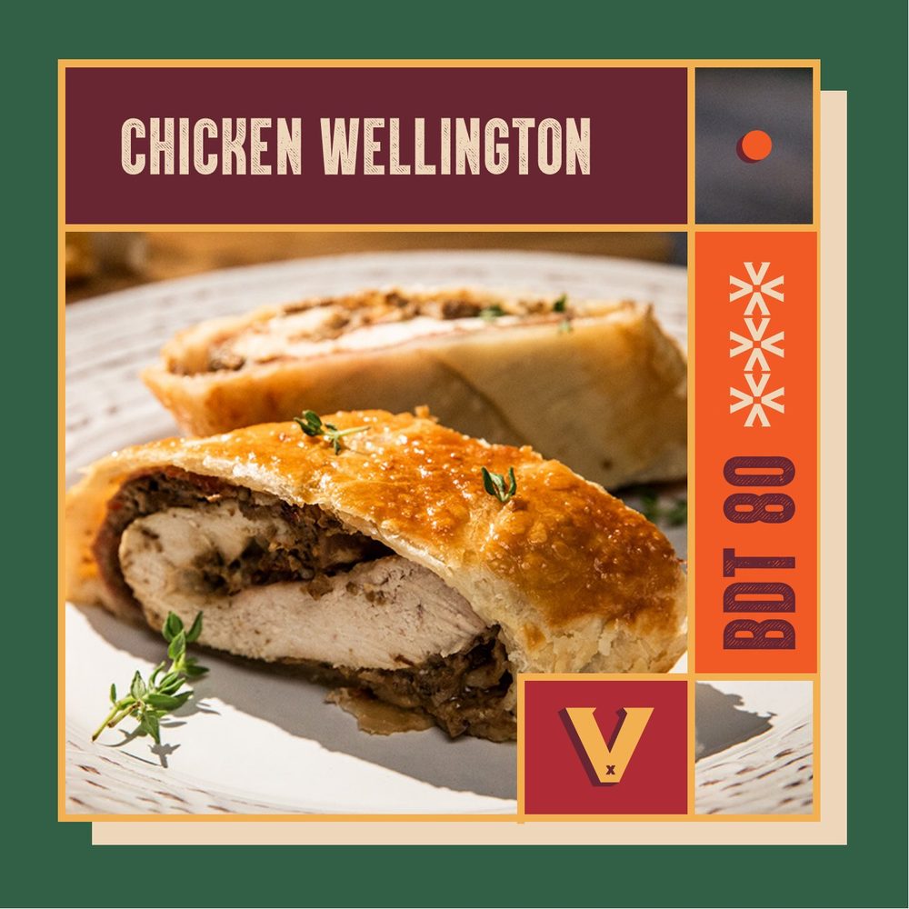
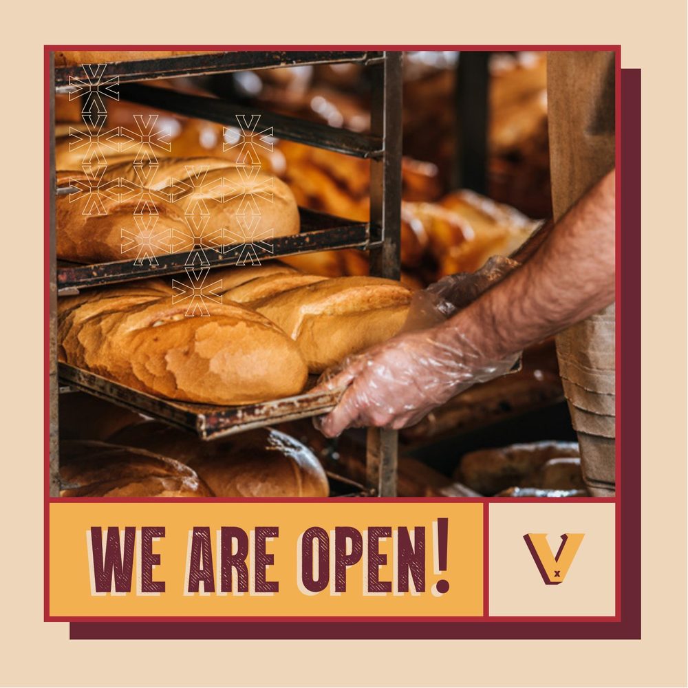
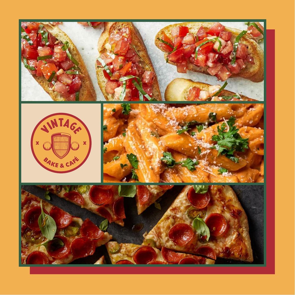
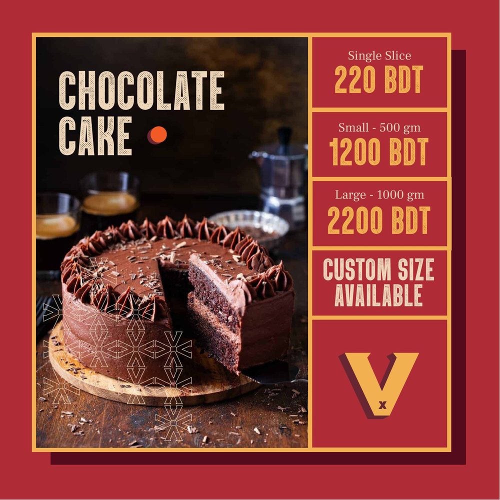
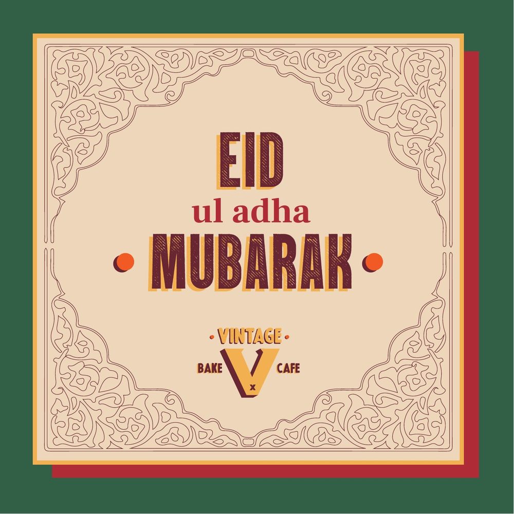
For the feed, we designed a set of square templates the team could reuse: a product with its price, a dish name running down the side, “We are open!”, a collage for the menu, a cake with its sizes and prices, and a greeting for Eid. Each one keeps the frame, the V and the colours, so the food can change every day without the feed losing its look.
Signs, cards and coupons
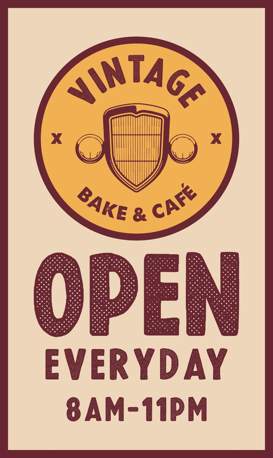
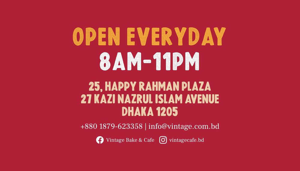
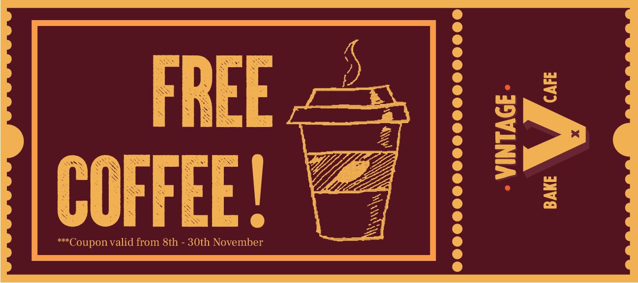
On the street, a lightbox carries the badge above “Open everyday, 8am–11pm”. Inside, the visiting card doubles as a coaster, with the badge on one side and the address and hours on the other. A tear-off coupon for a free coffee uses the same maroon and mustard, with the monogram on the stub.
Shooting the room and the menu
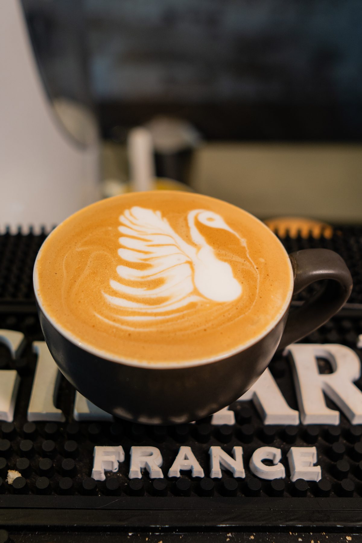
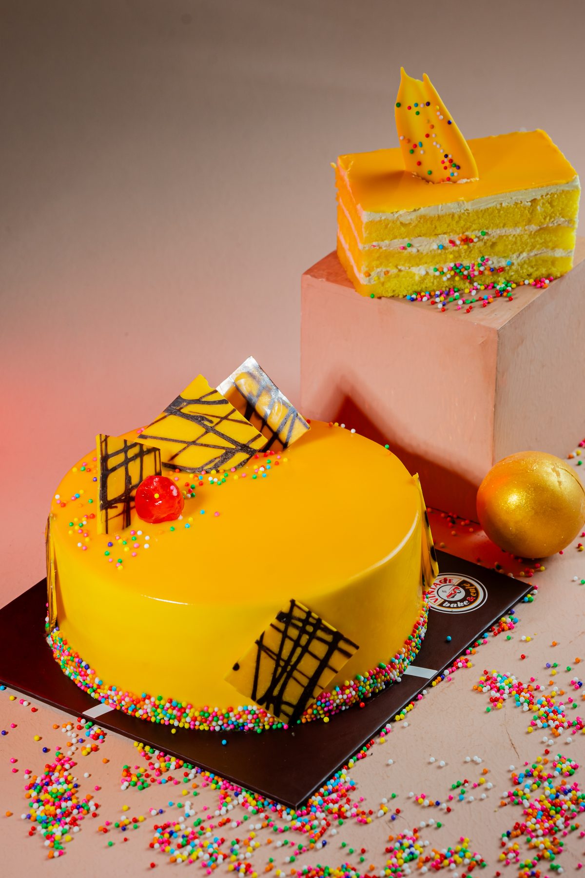
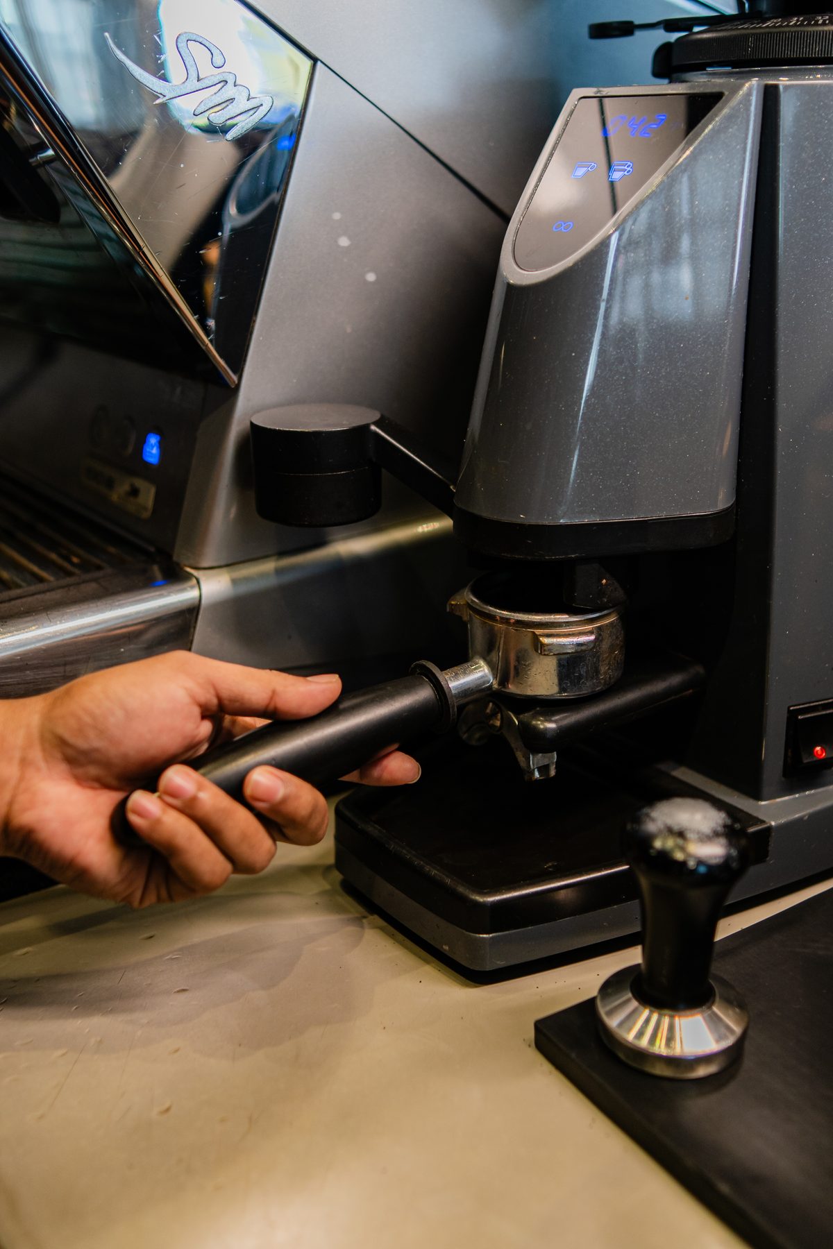
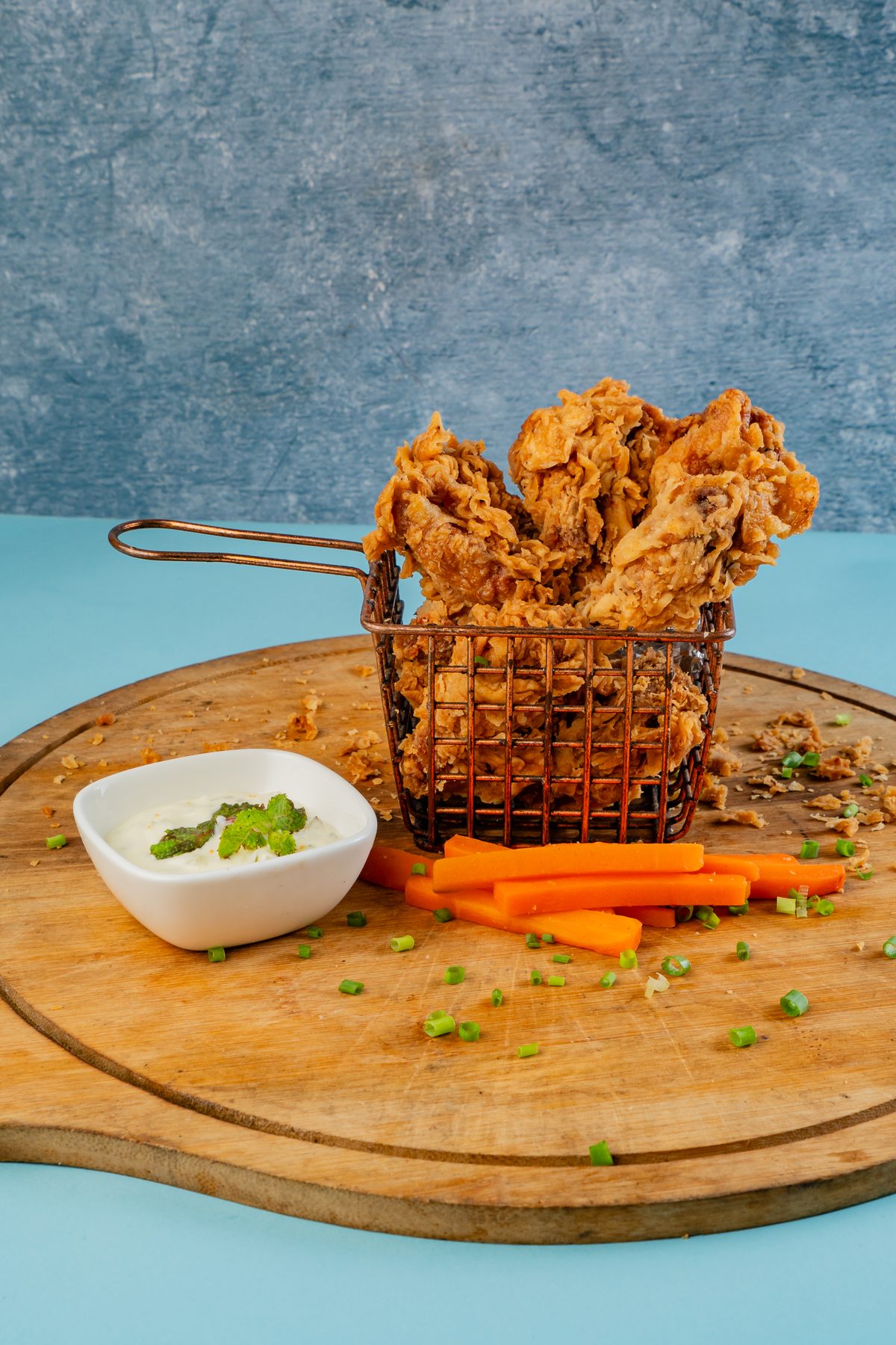
We photographed the café as it looks to a customer: the latte art, the grinder and portafilter, the cakes and the fried chicken, and the details that give the place its name, like the Chevrolet poster on the brick wall.
A box for the season
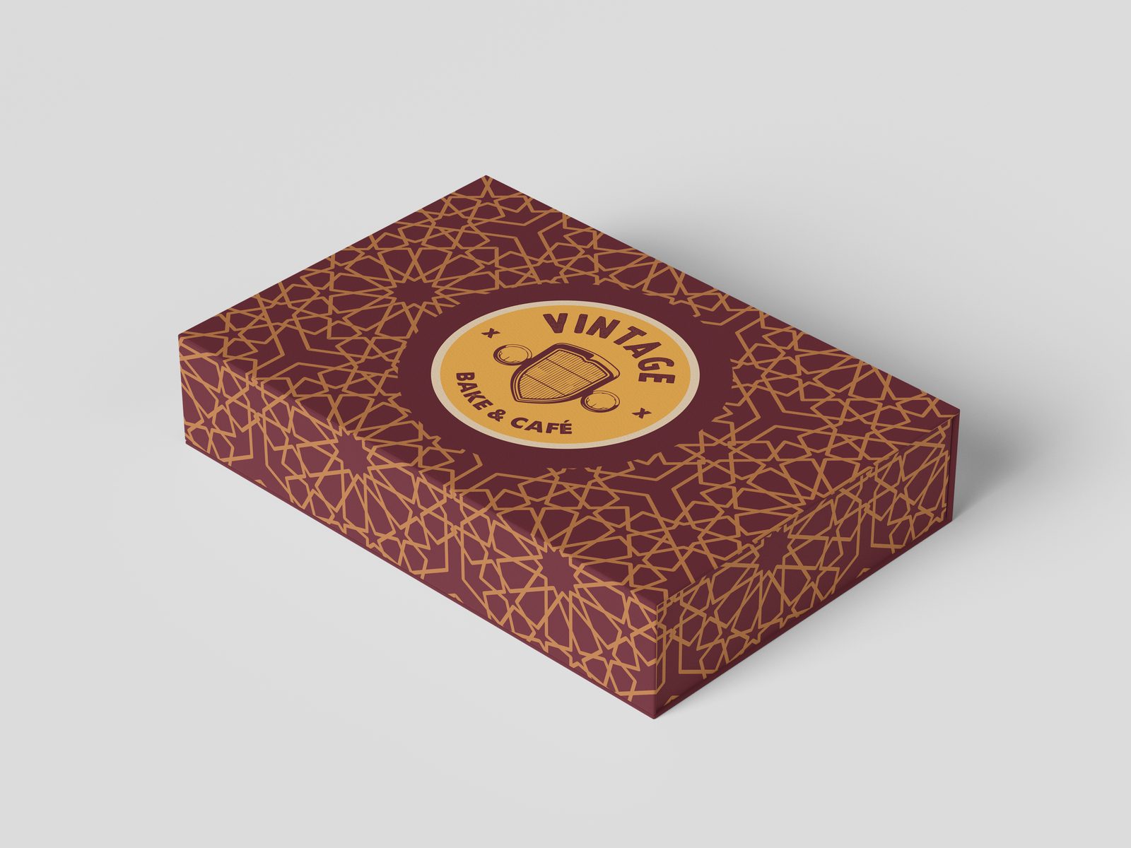
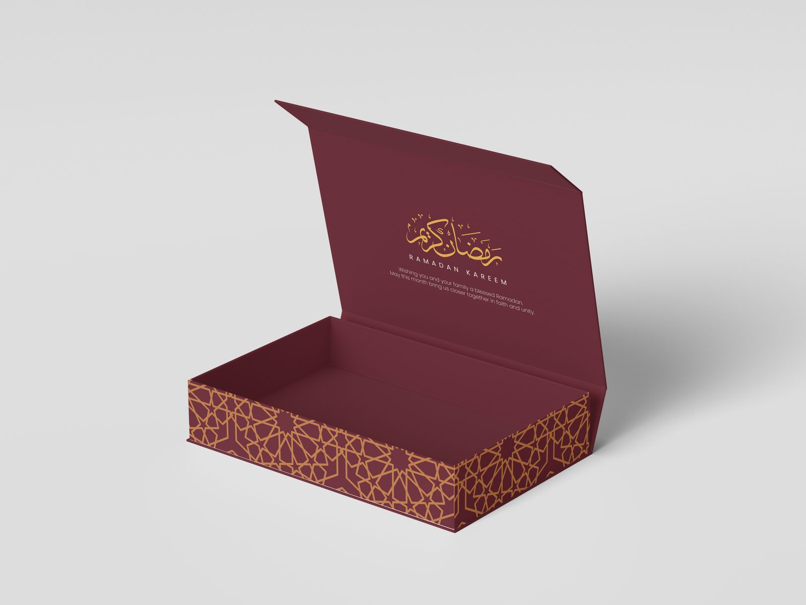
For Ramadan, the badge moved onto a gift box wrapped in a gold geometric pattern on maroon. Inside the lid, the box carries a Ramadan Kareem greeting in calligraphy. The same season brought a flyer, menu, event backdrops and food packaging.
The car is still there. It just looks like it belongs on the front of the building now.