Brio makes pizza and pasta the Italian way in Gulshan and Dhanmondi. When it added house-made gelato, it needed a cup for scoops served at Brio Station, at events and at festivals.
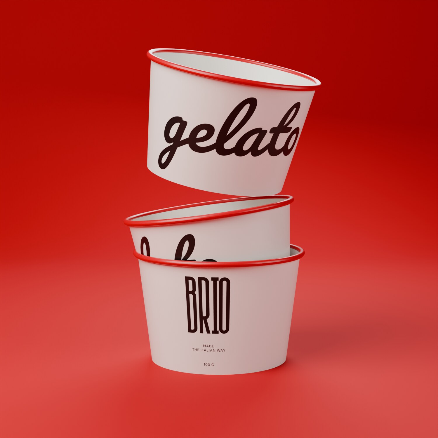
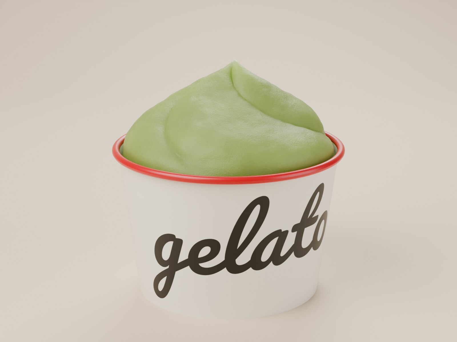
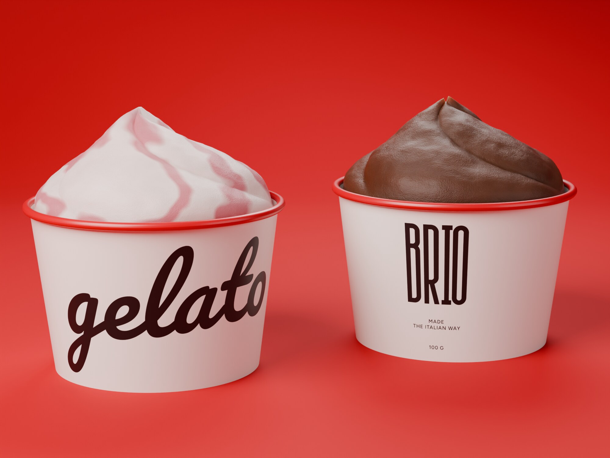
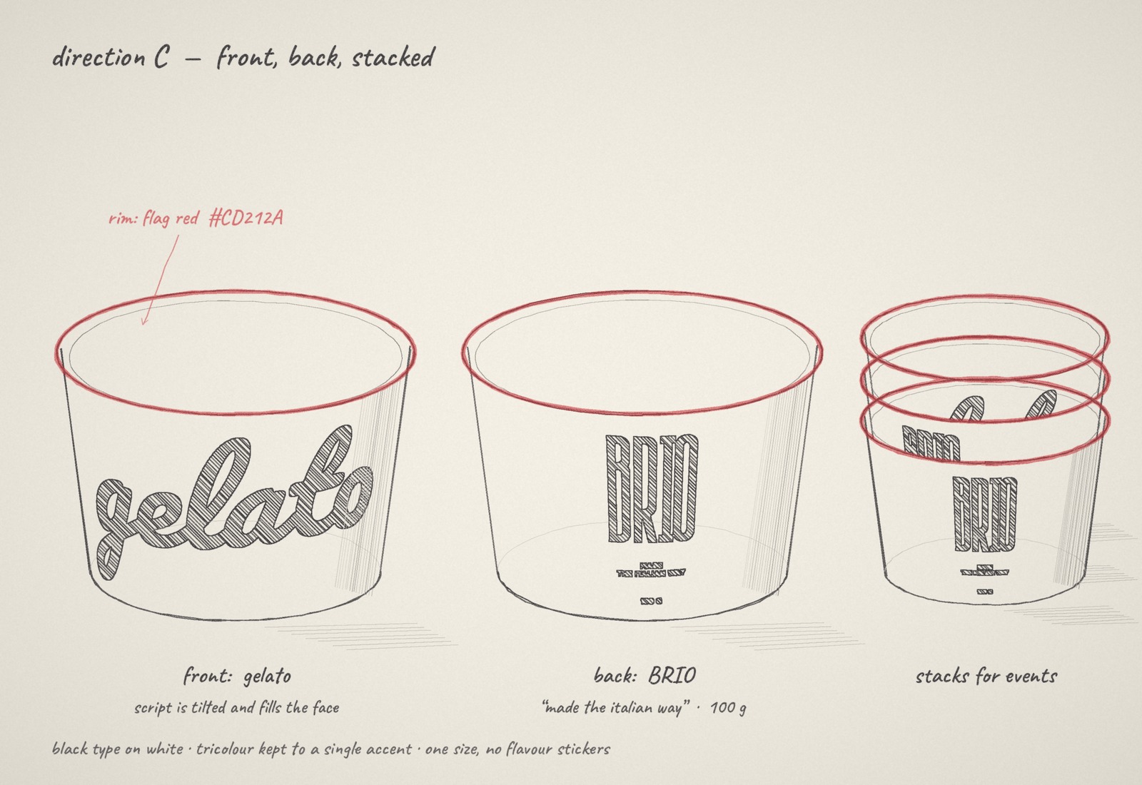
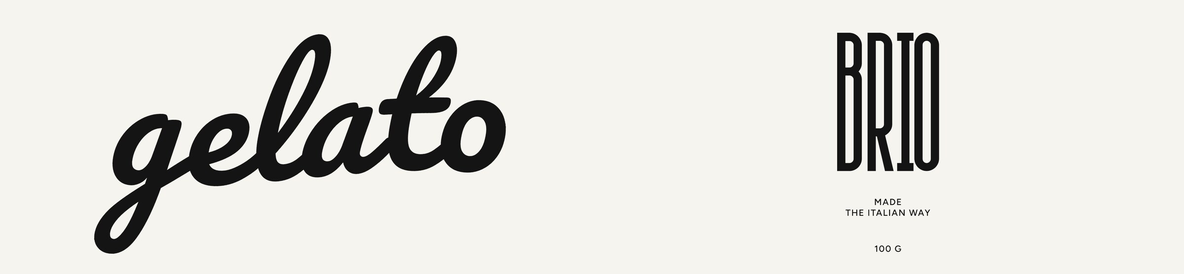
The Wider Collective designed the cup: a white paper tub with “gelato” in a single sweep of script, the Brio wordmark on the reverse, and a rim in the red of the Italian flag.
From sketch to filled cup in 15 seconds
Bold enough to photograph, still plainly Brio
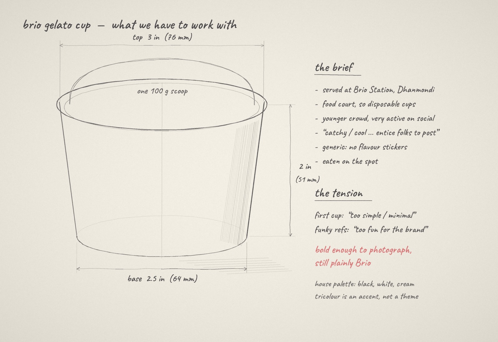
The cup was for Brio Station in Dhanmondi, a food-court kitchen with a younger crowd that posts what it eats. The brief asked for a cup people would want in the picture. It also ruled out the playful, patterned cups common in gelato: too much fun for a brand built on flour, fire and time.
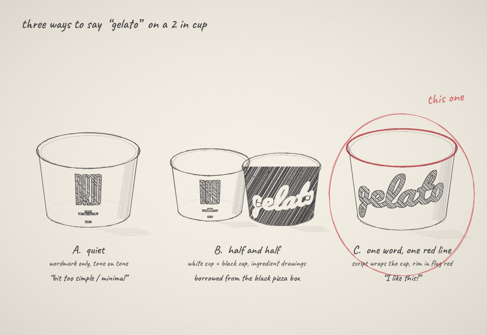
That left a narrow target. A first, tone-on-tone cup was judged too quiet. The identity gave us black, white and cream, with the tricolour allowed as an accent and never as a theme. And the canvas was small: two inches tall, holding one scoop.
Three ways to say gelato
We drew three directions. The first kept only the wordmark. The second split the idea across a white cup and a black cup with ingredient drawings, borrowing from Brio’s black pizza box. The third used one word, written large enough to wrap past the edge of the cup, and spent the tricolour allowance on a single red rim.
The third was chosen. From the front the cup says what is in it; turned around, it says who made it.
Print artwork
Built to the real dimensions
Before anything was printed we modelled the cup in 3D at its real size, with the rolled rim and recessed base of a paper tub, and wrapped the approved artwork around it. That showed how much of the script is visible from one side and where the wordmark sits when cups are stacked.
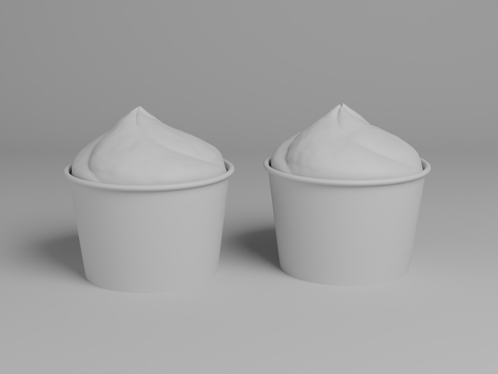
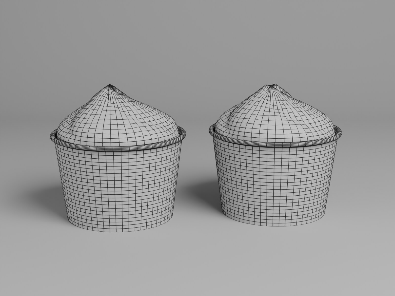
The cup, filled
The final renders show the cup as it is meant to be seen: on Brio red, filled, and from both sides. The script reads from across a counter, and the rim gives every photograph a red line.